Logopedia
Advertisement
This page only shows primary logo variants.
For other related logos and images, see:
1886–1888 1888–1911 1911–1939 1939–1955 1955–1958 1958–1964
1886–1888 1888–1911 1911–1939 1939–1955 1955–1958 1958–1964
1964–1974 1964–1974 1974–1988 1988–1999 1999–2018 2018–present

S. C. Johnson & Son (first era)[]

1886–1888[]

S.C. Johnson & Son 1886

1888–1911[]

1888 imagery

1911–1939[]

SC Johnson 11-39

1939–1955[]

1939 Admin Bldg logo

1955–1958[]

1955 Corporate Symbol
Logopedia InfoWhite SVG NEEDED

The logo features Johnson Wax HQ and the globe to represent international expansion.

Johnson's Wax[]

1958–1964[]

Johnson's wax-1958
Designer:  Lippincott & Margulies
Typography:  Venus
Launched:  May 28, 1958

Johnson & Son[]

1964–1974[]

Johnson - 1964
Designer:  Lippincott & Margulies
Typography:  Custom
Launched:  July 1964

Johnson Wax[]

1964–1974[]

Johnson Wax - 1964
Designer:  Lippincott & Margulies
Typography:  Custom
Launched:  July 1964

1974–1988[]

Johnson Wax 1974
Designer:  Unknown
Typography:  Custom
Launched:  1974

S. C. Johnson Wax[]

1988–1999[]

SC Johnson Wax

S. C. Johnson & Son (second era)[]

1999–2018[]

S.C. Johnson & Son

2018–present[]

S. C. Johnson - 2018
Designer:  Unknown
Typography:  Unknown
Launched:  April 23, 2018

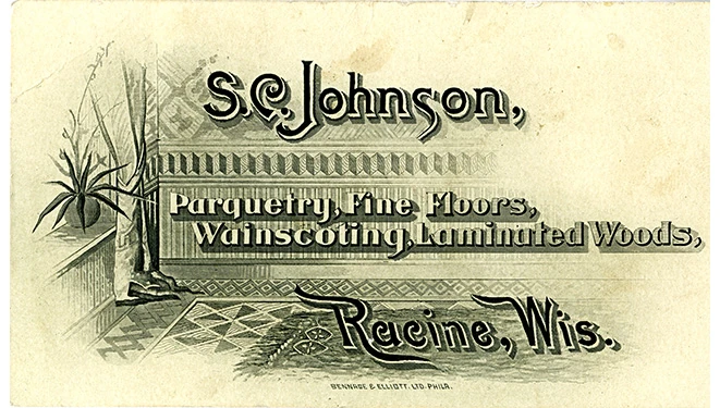
In April 2018, S.C. Johnson changed their logo, updating their tagline from “A Family Company” — which had been used since 1998 — to “A Family Company at Work for a Better World.”; according to the company, the updated tagline is “a reminder that SC Johnson holds itself to a higher standard.”


Advertisement