No edit summary |
|||
| Line 51: | Line 51: | ||
===2019–present=== |
===2019–present=== |
||
[[File:Sears 2019.svg|center|300px]] |
[[File:Sears 2019.svg|center|300px]] |
||
| + | |||
| + | The Sears logo has been changed to a more positive image. The Sears wordmark is still the same, but bolder, then the new icon is an "infinity loop" with a light green gradient. |
||
==External links== |
==External links== |
||
Revision as of 18:13, 10 May 2019
| 1923–1958 | ||||
| 1886–1923 | 1923–1958 | 1958–1963 | 1963–1984 | 1984–1994 |
| 1994–2004 | 2004–2010 | 2010–2019 | 2019–present | |
Sears Roebuck and Company
1886–1923
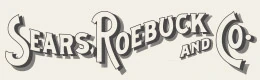
This is Sears' first logo from when it began as a mail order catalog. This logo is still used on occasion for promotional items.
Sears
1923–1958
| BETTER LOGO NEEDED |
1958–1963

| SVG NEEDED |
The font became Goudy Old Style.
1963–1984

1984–1994
In 1984, the logo was updated to the Helvetica typeface with white lines inside the letters.
1994–2004
This is a modified version of the 1984 logo. It is still in use in Mexico, and is still widely seen in the United States despite being succeeded by two other logos. It is still in use at several stores and malls in the United States and at the location at Arden Fair Mall in West Sacramento.
2004–2010
In November 2004, following the merger with Kmart and the creation of the Sears Holdings Corporation, the "ears" part was changed to lowercase. This logo is still used for several of Sears' subsidiaries, and also in Canada until 2016.
2010–2019
In late 2010, the entire font on the wordmark was changed and made lowercase.
2019–present

The Sears logo has been changed to a more positive image. The Sears wordmark is still the same, but bolder, then the new icon is an "infinity loop" with a light green gradient.