TV4 Plus
2003–2007
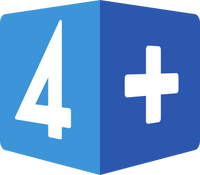
The logo for TV4 Plus was revealed in January 2003. It was a cube with two visible sides, one containing a "4" and one containing a plus sign. When on screen, it would often spin or "roll" like a dice. The graphics for the launch of TV4 Plus were created by the British design agency Kemistry.
- "The cubic form shall mark a difference to TV4 but also convey a feeling of play and games which will be a part of the content in TV4 plus" - TV4 press release[1]
A new set of idents replaced the original ones in 2005.
2007–2011
TV4 Plus was completely overhauled with a new graphics package which launched on February 5, 2007.
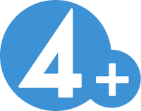
The new logo was designed by the Swedish design bureau Ohlsonsmith.[1] It features the logo used by TV4, but in blue colour and with a plus sign added to the right. The new graphics were created in-house, with concultancy from Martin Poole. The idents feature regular people while doing their hobbies.[2]
Sjuan
2011–2018
2018–present
- ↑ Den kubiska formen ska dels markera skillnaden till TV4 men också förmedla en känsla av lek och spel vilket blir en del av innehållet i TV4 plus.
| Telecommunication operations: Telia: Sweden and Denmark | Norway | Finland | Estonia | Lithuania Media operations: MTV (Finland): C More Entertainment1: Estonia: Lithuania: Defunct/Former operations: Telecommunication operations: Television channels:
1Distributed by TV 2 in Norway. |


