No edit summary Tag: Visual edit |
(Couple more videos added for 2019. First anniversary of rebrand.) Tag: Visual edit |
||
| Line 102: | Line 102: | ||
Sony Max 20 Years Image Spot|20th anniversary promo, there being no graphics reel available. |
Sony Max 20 Years Image Spot|20th anniversary promo, there being no graphics reel available. |
||
Sony Max HD New Intro Now - Next - Tonight |
Sony Max HD New Intro Now - Next - Tonight |
||
| + | Sony Max Idents 2019 • Coming Up Next, Blockbuster Dopahar, Sunday Housefull|Movie idents. |
||
| + | Max Box Office ident on Sony Max since 2019|''Max Box Office'' ident with sponsors. |
||
</gallery> |
</gallery> |
||
| − | |||
{{Sony Pictures Networks India}} |
{{Sony Pictures Networks India}} |
||
Revision as of 11:16, 20 July 2020
This page details the on-air graphics packages used by the Indian TV channel Sony Max. It has been split from the main Sony Max page.
Overview of graphics packages
1999–2010
2002–2007
2007–2010
This video was created in 2007. The graphics package of Sony Max is featured along with those of SET, Sony Sab and Sony Pix, which was launched the previous year (April 2006).
2010–2012
The graphics featured the Avant-Garde font that has formerly been used by many Sony channels.
2012–2015
A new look was introduced on 28 May 2012, on the same day that Sony TV HD was launched, and a day after the final of that year’s Indian Premier League. This was designed by Charlie Co, a California-based agency.
The popular Gotham font was introduced as the channel’s main on-screen typeface, with Avant-Garde playing a secondary role. Gotham, like Avant-Garde, has been used by several Indian Sony channels, most recently Sony Sab in 2019.
- Presentation Archive (UK) (the graphics were introduced in India only in 2012, not 2010)
- Campaign India
This graphics package was reused by Sony Wah from its launch in 2016 until 2019, when it adopted the 2014–17 graphics package of Sony Max 2.
2015–2019
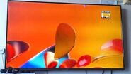
A new graphics package was introduced introduced on 25 May 2015, a day after the final of that year’s Indian Premier League (like in 2012), and designed by the Argentine creative agency Plenty. It featured petal-like shapes folding and animating across blue, yellow and red backgrounds.
The on-screen fonts were Grumpy Black24 for headline text and Effra for body text, replacing the long-standing Gotham and Avant-Garde, though Gotham continued to be used on social media. While the SD channel used a blue, yellow and red graphics package, the HD feed, launched on Christmas 2015, used a bronze-gold graphics package.
SD channel (May 2015–July 2019):
HD channel (December 2015–July 2019):
- Rebranding page on Behance (the bronze graphics used by Sony Max HD are in the ‘Festive Package’ section)
- Art of Channel Branding
- Graphics montage
- DreamDTH
2019–present (twentieth anniversary)
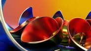
Another graphics package was introduced on 20 July 2019 to celebrate the twentieth anniversary of the channel. Sony Max reverted to the yellow, tan and orange colour combination used in 2012–2015, dropping blue and red, but with a new graphics package. Unlike with the previous few graphics packages, no design credit was given.
The key design element is a rectangular frame that rotates and casts shadows on the screen. The on-screen font is now Montserrat, a widely popular font developed in Argentina, the country where many channels of Sony and rival network Zee had their graphics packages created.
| Part of Sony Pictures Entertainment
Indian TV channels: Hindi: Entertainment: Sony TV HD, Sony Sab HD and Sony Pal | Movies: Sony Max HD (Other), Sony Max 2 (classic movies) and Sony Wah | Kids: Sony Yay Sony Sports Network: Sony Sports Ten 1 HD, Sony Sports Ten 2 HD, Sony Sports Ten 3 HD (Hindi), Sony Sports Ten 4 HD (Tamil and Telugu), Sony Sports Ten 5 HD International channels: SET (Asia) | Sony KAL Video-on-demand: SonyLIV Defunct channels: Content production arm: Studio NEXT
Notes: |

