| 1983-1985 | ||||||
| 1970-1972 | 1972-1976 | 1976-1981 | 1981-1983 | 1983-1985 | 1985-1987 | 1987 |
| 1987-1988 | 1988-1996 | 1996-2000 | 2000-2008 | 2008-2014 | 2014-present | |
TV Gazeta
1970-1976
1970-1972

The TV Gazeta enters the air and chooses the "Toucan" like its mascot, a representation of the "brazility" of the transmitter. But instead of presenting it literally, it gains an interesting stylization, forming the letter "G".
1972-1976
The first logo of the station receives color as well as its programming.
Rede Gazeta
1976-1981

TV Gazeta gains fame as "Channel 11", and gains a new logo to follow the moment.
1981-1983

Total change in identity! The TV Gazeta consolidates like "Channel 11". But if you think the famous "G" of Gazeta is gone, see the drawing that the letter C does with the number 1!.
1983-1985
TV Gazeta wins a simpler logo, giving full prominence to the channel number.
1985-1987

The TV Gazeta logo gains futuristic aesthetics. The station also focuses on São Paulo, and this is reflected in the logo: the two numbers "1" form, in the center, the map of the Brazilian state of São Paulo.
Gazeta (first era)
1987

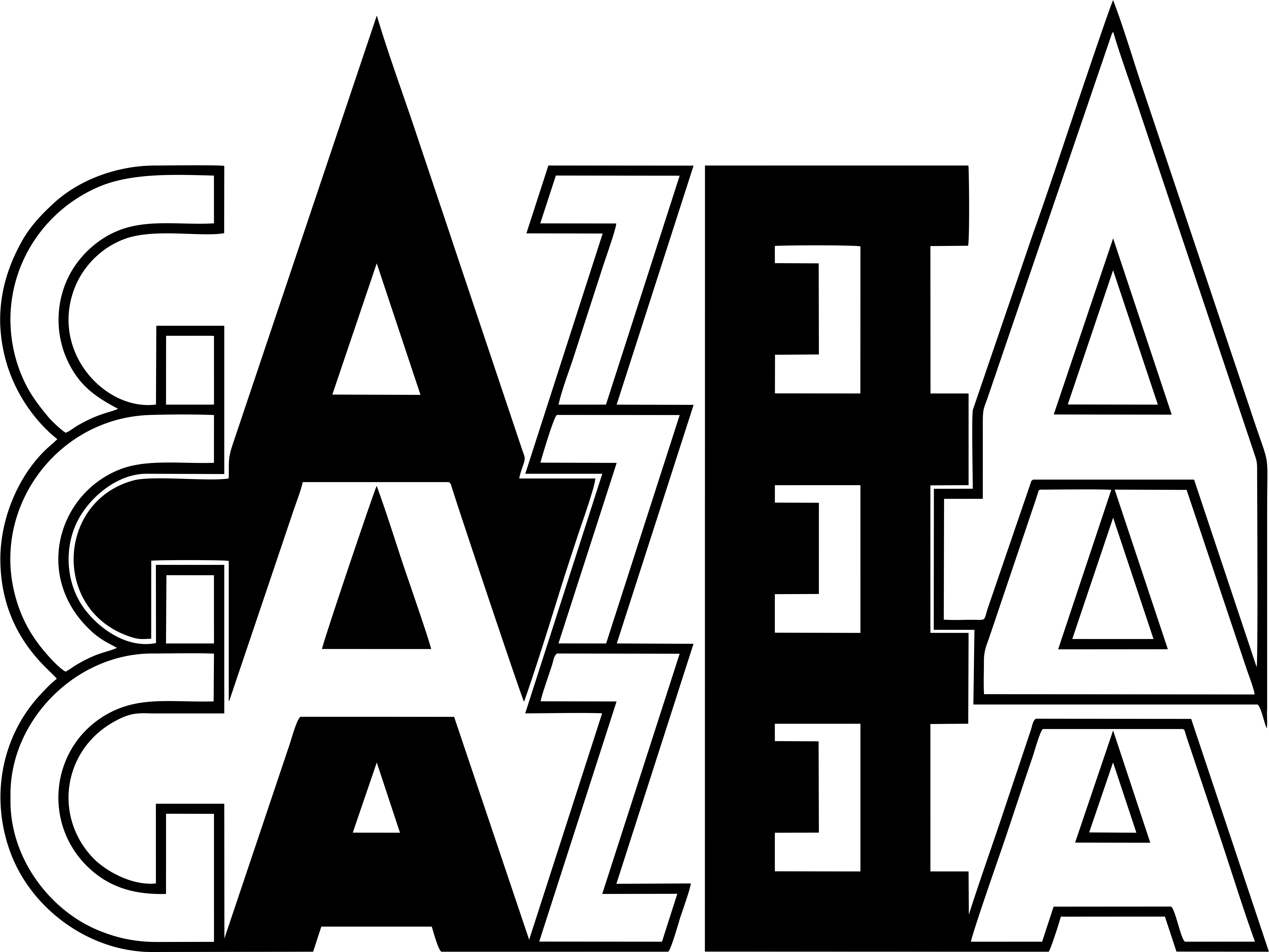
With a more simplistic appearance, the station only signs the name "Gazeta" - recalling the aesthetics of 1984 - and adopts an extra-bold geometric typography, similar to the printed newspaper "A Gazeta".
1987-1988
Created by Fernando Cerqueira Lemos in 1978, the art of the facade of the building also becomes the logo of the São Paulo radio station. It represents the three Gazetas: the TV, the Radio, and Sports club.
TV Gazeta OM/OM TV Gazeta/TV Gazeta CNT
1988-1996

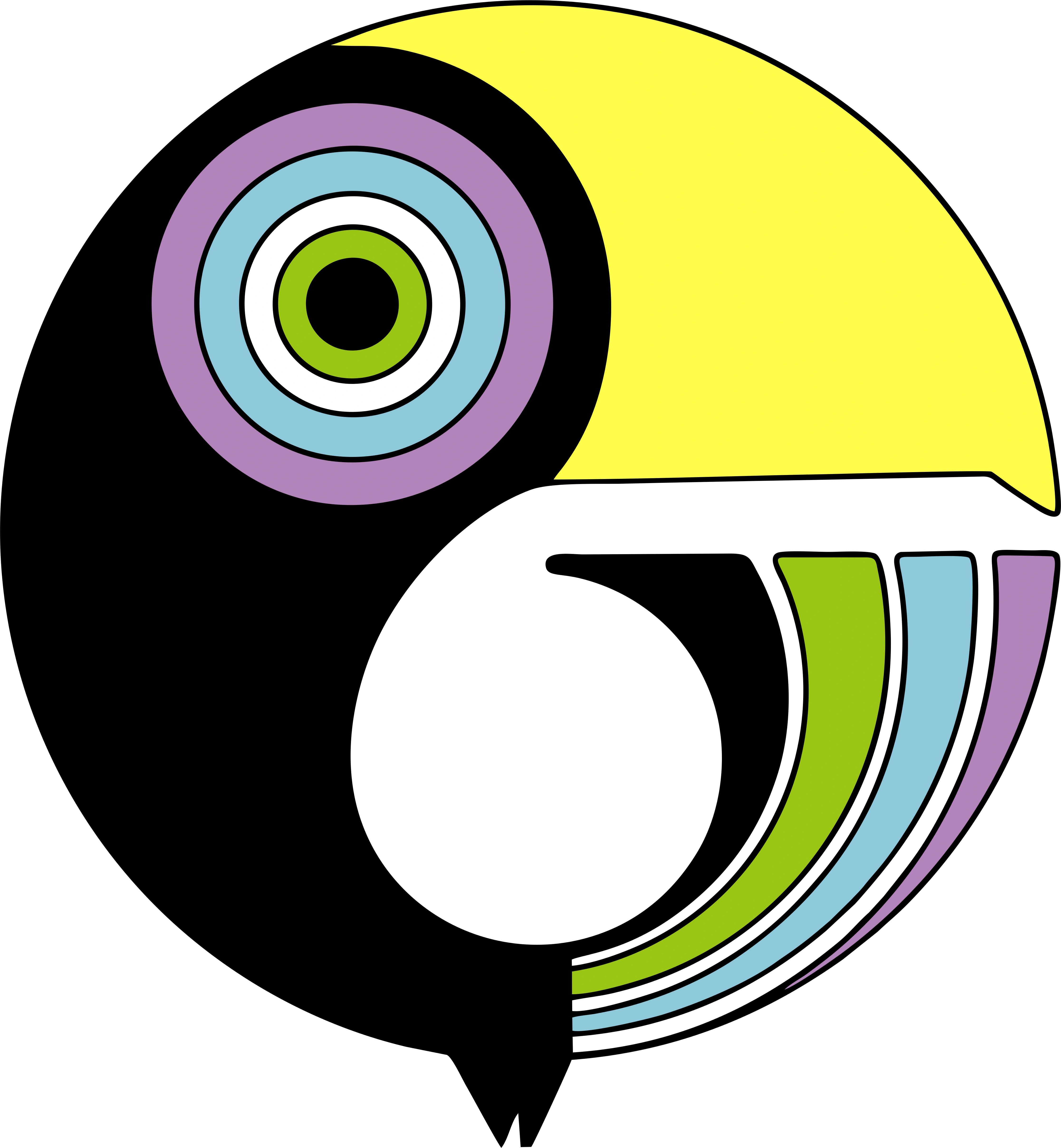
The new TV Gazeta logo features three colored rings. They represent the circular points that make up the analog TV picture. But the colors chosen are actually the basis of the color print: cyan, magenta, yellow and black, a direct reference to the origins of the station.
CNT Gazeta
1996-2000

")
TV Gazeta and CNT are signing a content partnership, signing the name "CNT / Gazeta". The new logo is a variation of the original network from Curitiba.
Gazeta (second era)
2000-2008

With the end of the partnership between Gazeta and CNT, the São Paulo broadcaster resigns only its name. The "G" returns to gain prominence, and gains symbol status.
2008-2014
The "G" was slightly changed.
2014-present

")
")
The TV Gazeta undergoes a general repagination of identity, positioning and brand: the new logo has an aesthetic pattern in flat design, with the colors orange and gray. Lighter visually, the programming also undergoes adjustments and has a greater focus in São Paulo. The "G" symbol, hitherto shown in perspective, now appears in the front view.. In 2015, the "G" and number 45 for 45th years anniversary are "Gazeta - G 45 anos". In 2020, the "G" and number 50 for 50th years anniversary are " Gazeta - G 50 Anos 1970-2020"
External links
- Logotipos – Fundação Cásper Líbero
- Comercial de 40 anos de TV Gazeta - Versão 1
- Comercial de 40 anos de TV Gazeta - Versão 2
- Comercial de 40 anos de TV Gazeta - Versão 3
Template:Television Networks BR