This page only shows primary logo variants. For other related logos and images, see:
|
TV Perú is the Peruvian public television channel and the first in the country, founded on January 17, 1958 as an experimental channel of the Ministerio de Educación del Perú with donations from UNESCO that broadcast three times a week and whose first programmes were documentaries on television and the installation of antennas.
It is the oldest next to América Televisión, Panamericana Televisión and the disappeared Canal 9 TV El Sol (today ATV).
Its programming is varied, although with more focus on culture as a public channel and is owned by the Instituto Nacional de Radio y Televisión del Perú (IRTP).
Garcilazo de la Vega OAD-TV
1958-1969


TV Peru was originally established on the 22nd floor of the Ministry of Education on January 17, 1958. The first logo of the channel that is registered were simple letters with the code name of the station at that time in Futura Black typography.
Televisión del Estado
1969-1974


Then in 1969, with the transfer of the canal to its current headquarters in Santa Beatríz and in full military dictatorship of Juan Velasco Alvarado, it was renamed "Televisión del Estado" and the logo was a number "7" formed by figures and to the right, the word "tv" in a round typeface, all white on top of a black television screen.
1971-1974


In 1971, a variant of the logo was made, consisting of a 7 in an extravagant Roman typography and above the top of 7, the word "CANAL".
ENRAD Perú Canal 7
1974-1978


Then in 1974, it was renamed "ENRAD Peru Canal 7" and its logo consisted of three white rings bordered by black with a black circle, on top of this 7 and on top of the number, the word "CANAL".
1978-1979


With the arrival of color television in 1978, the logo was modified, returning in "7" of 1969, modified this time, in the base above the word "CANAL", below and to the right, the word "tv" and below, the logo of ENRAD Peru in a white circle.
January-June 1979


In January 1979, a variant of the previous logo was made, which consisted of the word "SIETE" formed by figures with the "T" being replaced by a 7 and at the top of the 7, the word "CANAL".
This logo, together with the previous one, were used together until June of the same year.
1979-1980


Then, in June 1979, a new logo was used, which consisted of a light blue edge and white interior television screen with a pair of headphones on its left and right sides, inside the screen, the word "SIETE", with the T being replaced by a number 7 of the 1978 logo and above, the word "CANAL".
Radio Televisión Peruana (first era)
1980-1981


In 1980, the channel acquired its first commercial name of "Radio Televisión Peruana" and its first logo consisted of a television screen with yellow border and red interior with shadow inside the red part, above, the word "CANAL" in Helvetic typography Condensed glued and with shadow and on the right side, the number "7", both yellow and shadowed.
1981-1982


Then in 1981, a new image was made to match the name of the channel at that time, consisting of a red oval with a thick border and a metallic yellow color and inside the red part, the yellow letter "R" that with the various divisions of the letter, they subtly form the acronym "RTP".
1982-1985


Then, in 1982, a new logo was launched, this time it consists of a white interior square and dark blue-purple border annexed to a light blue-purple striped 7 and inside the white part of the square, the acronym "rtp" in italic and dark bluish purple.
TV Perú (first era)
1985-1988

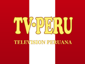
In 1985, the channel is renamed "TV-Perú" (being the first time it uses a name that would be the current name, but without the script) and its logo consisted of a flag of Peru and above this, the name "TV-PERU" in Cooper Black Condensed typography and below, the full name of "TELEVISIÓN PERUANA" in Roman typography and light yellow typeface with mustard colored border.
1986-1988


In 1986, a variant was used in conjunction with the aforementioned logo of the Peruvian flag and was the previous logo of the channel under the name of RTP, but now, the said acronym is replaced by the word "TV" (a bit similar to TVN logo from the 90s) and the colors become black and white.
1988-February 1989


In 1988, a new image was used consisting of the letters "7TV" in 3D and in golden color. This served as a transition logo between TV-Peru and the return to the name of Radio Televisión Peruana.
Radio Televisión Peruana (second era)
February-November 1989


In February 1989, he returned to the name of Radio Televisión Peruana (name that would last until 1997) and the logo was the letters "rtp" with the appearance of the 1982 gold-colored metallic logo on top of a slightly inclined blue map of Peru. It was only used in IDs until November of the same year.
1989-1990


In November 1989, a new logo was made to the new RTP and now it changes to a metallic gray television antenna with the letters "rtp" in metallic yellow and above the "t", a star-shaped glow that It emulates the reception of the signal and, below all, the name "Radio Televisión Peruana" of red color.
1990-1993


In August 1990, the logo was changed, consisting of a metal sphere cut in such a way that it forms a "7" and below, the letters "RTP" in Helvetica Bold typography in golden yellow and in 3D.
1993-1997


On January 11, 1993, a new image was launched and definitely the last one under the name of Radio Televisión Peruana. The logo consisted of a light yellow "R", a bright blue "t" and a fuchsia "P" with a circle inside the "P", to the right of the letters, a colored border bright blue, all in 3D and below, the name "Radio Televisión Peruana" in Bodoni Condensed typography and below, the word "SATELITE" in Helvetica Bold typography in italics and in separate letters.
Televisión Nacional del Perú
1997-1999


On July 5, 1997, with the creation of the IRTP, the channel definitively abandoned the name of "Radio Televisión Peruana" and was renamed "National Television of Peru" or known by its acronym "TNP". The logo of that stage was a corrugated sun with seven orange-colored square stripes, underneath, the acronym "TNP" of red to white gradient in the middle, all shaded and below, the name "TELEVISIÓN NACIONAL DEL PERÚ".
1999-2001


Then, on October 6, 1999, the channel changed its logo. This consisted of the acronym "tn" (instead of "TNP") of golden color and in 3D surrounded by a ring with the colors of the flag of Peru, all shaded and below, the name "TELEVISIÓN NACIONAL DEL PERÚ".
2001-2006
2001-2002


On August 5, 2001, the channel returns to the acronym "TNP" and the new logo consists of three rectangles, each with the colors red and white, the colors of the flag of Peru, above the red rectangles, the letters "T" and "P" in white and in the white rectangle, the letter "N" white, all in 3D with gradients and shadows surrounded by a white line and below, the name "TELEVISIÓN NACIONAL DEL PERÚ".
2002-2005


In 2002, the rectangles become semi-perfect squares, the color of the squares becomes golden yellow, the letters are less narrow and with 3D effect and degraded in the "T" and "P" and the squares become being together and below, the name is now lowercase.
2005-2006
On December 12, 2005, a logo change was made as part of the transition between the name "Televisión Nacional del Perú" and the current name of TV Peru. This logo is the squares, which become red, the letters lose the 3D effect, but retain the shadows and gradient border on the squares and below, the name capitalizes the first letters of each word, except the pronoun.
TV Perú (second era)
2006-2009
2006-2008


On November 19, 2006, the channel adopts its current name of TV Peru. The reason for putting that name was because the vast majority of Peruvians called the channel TV Peru despite the fact that the name has been discontinued since 1989.
The first logo under the new name was the representation of a gray-bordered parabolic antenna and on the right side, the name TVPerú in Myriad Pro Bold typography in italics, highlighting the tilde-shaped cut in the letter "u" and the letters "TV" together, whose structure would remain until now (except in the first case, which was used until 2019).
The letters TV are gray and the word "Peru" is red.
Occasionally, the logo was totally gray or white.
2008-2009


On October 1, 2008, the logo is slightly modified, losing the 3D effect and with slightly brighter colors.
2009-2012
2009-June 2010


On August 5, 2009, as part of a restructuring in the IRTP, a logo change was made and the advertising of private companies was eliminated, only transmitting state advertising and spots (this would be preserved until the beginning of 2015). As for the logo, the representation of the satellite dish was eliminated, the colors are inverted ("TV" in red and "Peru" in a darker gray color) and in Helvetic typography in italics, where the acronym "TV" stands out thicker and the tilde is now a slightly inclined tree leaf and located in the upper right of the "u".
June-November 2010


In June 2010, the logo was made in 3D, similar to the 2006 logo.
November 2010-2012


On November 18, 2010, the channel slightly modified the logo, removing the gray and becoming entirely red, which would remain in the subsequent logos.
2012-2019
May 7-17, 2012


On May 7, 2012, the channel made a major makeover for the first time in three years (until 2019) and the logo consisted of the representation of a red-and-white cockade and underneath, the name "TV PeRú" in a slightly Aller typeface modified, with the "e" and the "u" enlarged to be the same size as the capital letters. The logo was criticized not only for resembling the logo of the chain stores Target, but for referring to the Partido Nacionalista Peruano (then "Gana Perú") due to the appearance of the white ring of the logo.
May 17, 2012-2013


Only 10 days after the previous logo was launched, the image was redone, eliminating the logo badge after this controversy.
2013-2019


On the national holiday of 2013, TV Perú slightly modifies its logo, which adds the new IRTP logo to the right side of the logo separated from a gray vertical line and the appearance and spacing of the letters is slightly modified.
2019-present


On April 22, 2019, TV Perú completely modified its image for the first time since 2012 and came out much better than the contoverted image of 2012. The logo now consists of the letters "tvperúpe" ("pe" is the current name of the IRTP) in Gothic 725 Black typography of a pastel red color, whose last two letters are framed and perforate a semi-prefect square also of a red color pie. For the first time in the history of the channel, the name of the channel is used in lowercase letters and the "v", for the first time it shades to the top of the "t" instead of joining in this letter. The variant of this logo omits the word "peru" from the name from an animation, stylizing "tvpe", in which the word "tv" is red and the logo "pe" is transparent in color piercing the square.
The logo was created in the graphic department of the IRTP.
| Predecesor entities Empresa Nacional de Radio y Televisión del Perú | Empresa Nacional de Cine, Radio y Televisión Peruana | Sistema Nacional de Comunicación Social Television channels: Radio stations Digital platforms
Former/Defunct radio stations and television channels:  |


| Institutional Members ATA | ARPA | ABERT | ANATEL (Chile) | ARCHI | ASOMEDIOS | CANARA (Costa Rica) | ACTVE | AER | ASDER | NAB | Cámara de Radiodifusión de Guatemala | Cámara de la Industria de la Radio y Televisión | Unión Nicaragüense de Radiodifusores | Asociación Panameña de Radiodifusión | Asociación Paraguaya de Radiodifusión Privada | Cámara Paraguaya de Estaciones de Radio y Televisión | Sociedad Nacional de Radio y Televisión (Perú) | Asociación Nacional de Broadcasters Uruguayos | Cámara Venezolana de Televisión | Cámara Venezolana de la Industria de la Radiodifusión | Unión de Asociaciones de Radiodifusión de Centro América Television  |