Is a black rectangle, with a number 2 in the right, and "CANAL" on the left in vertical. As appeared on training manuals.
1995-1997
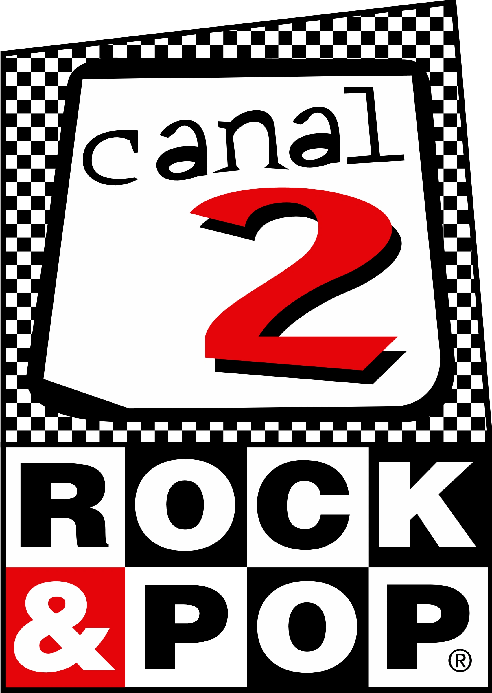
Rock & Pop Television Channel 2 was on the air on August 16, 1995. The first official logo for Channel 2 was the Rock & Pop logo, below an irregular checked polygon which contains the word "canal" and a red number 2.
1997-1998
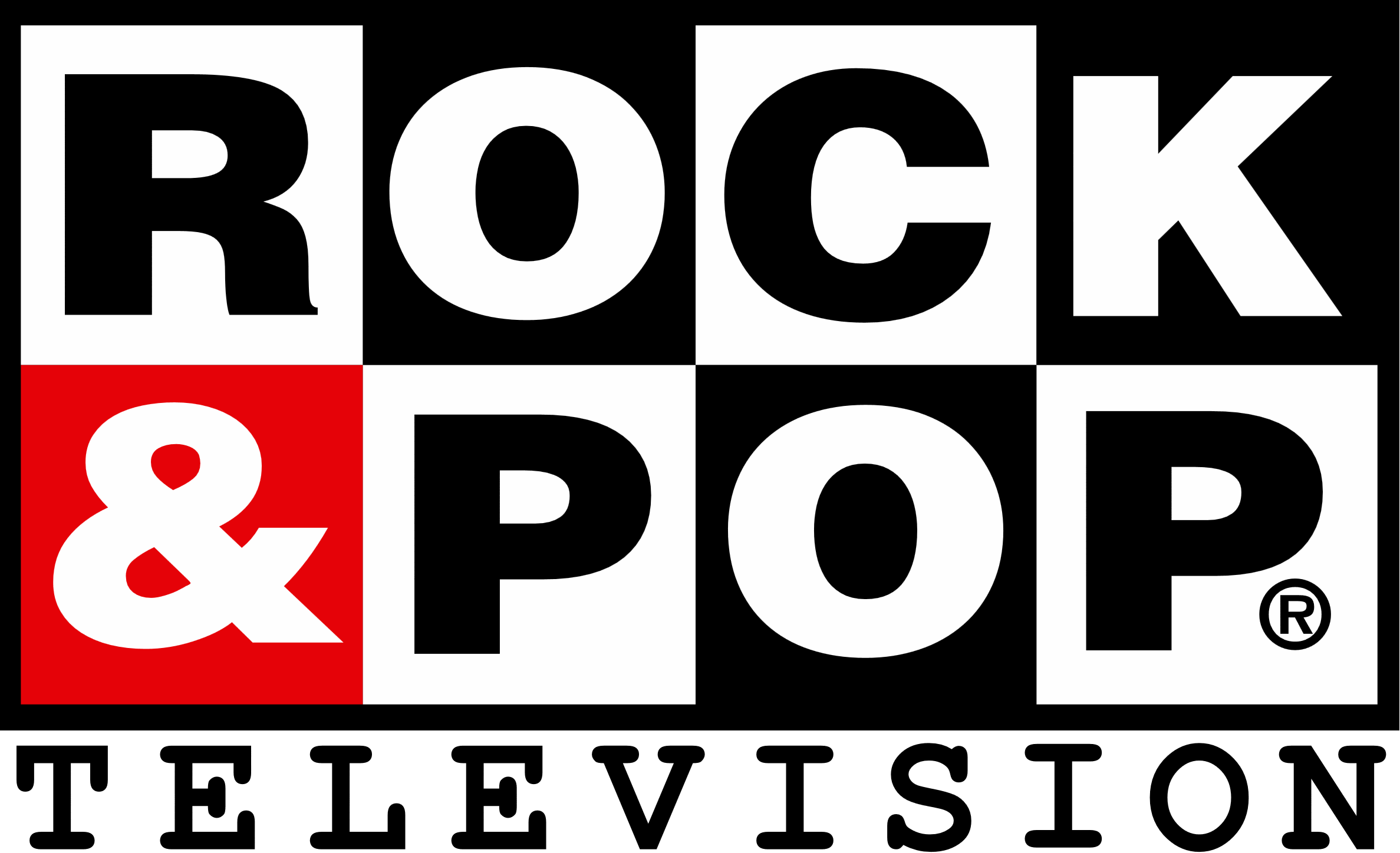
The logo was simplified in 1997, leaving the Rock & Pop logo with "TELEVISION" below.
Canal 2
1998-1999
The third and last logo for Rock & Pop Television is a big yellow number 2, with a red dot in the upper curve, and "CANAL" inside it. Used until the end of the channel.
Red Vidavisión
2001-2005
Vidavisión was an evangelical channel that began broadcasting at the beginning of 2001 and disappears in July 2005. Their logo consisted in 2 blue stripes that form a "V", with a blue sphere above them.
Telecanal
2005 (pre-launch)
A pre-launch logo was registered in Chile by Jaime Cuadrado Herrera at INAPI (Instituto Nacional de la Propiedad Intelectual). We see a serie of circles (the first and last ones are blue, the second and fourth ones are green, and the middle one is red) next to the words "telecanal" and "television" (which is smaller)
2005-2011
2005-2007
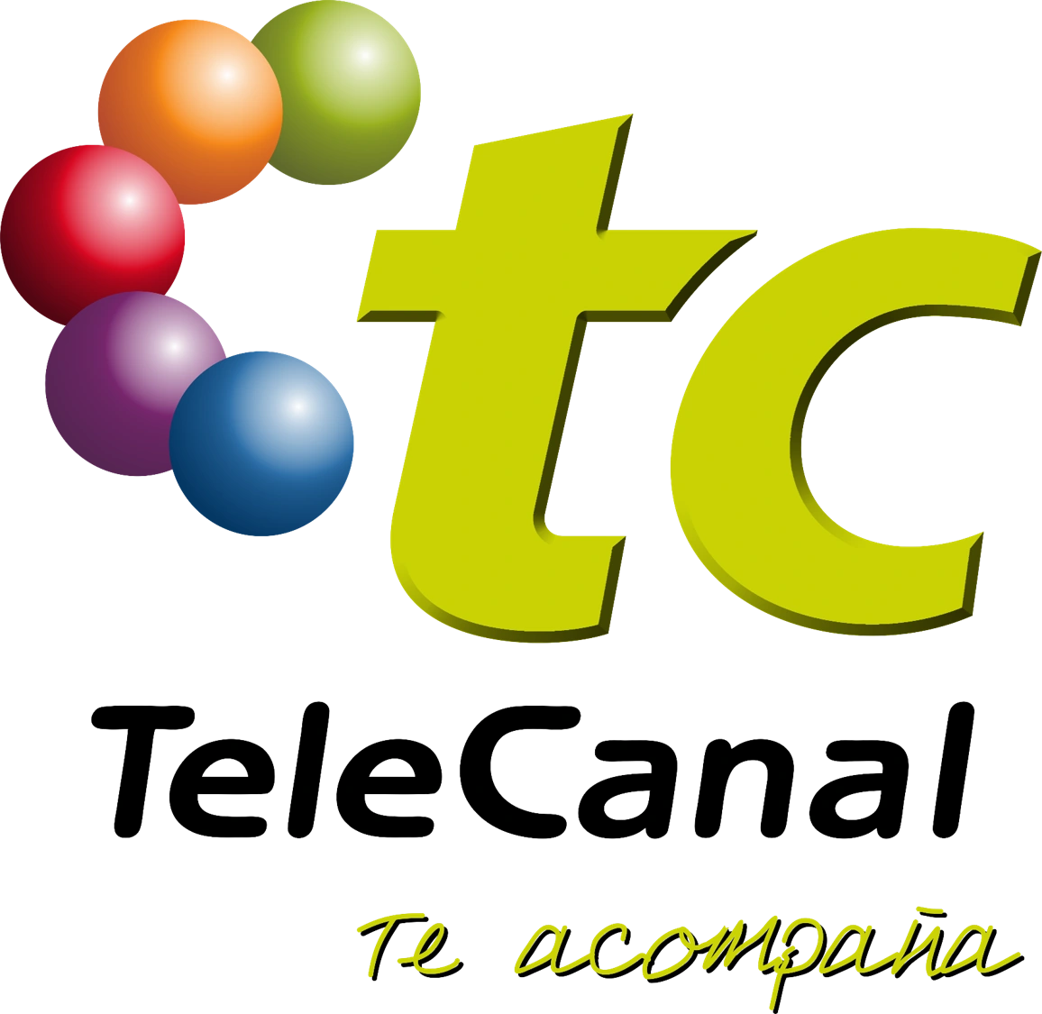
Its first logo was a series of spheres joined of blue, purple, red, orange and lemon green that formed a curve. Also, next to it, the letters tc were located in lowercase and greenish yellow. Below these, was the legend TeleCanal, also in italics and black.
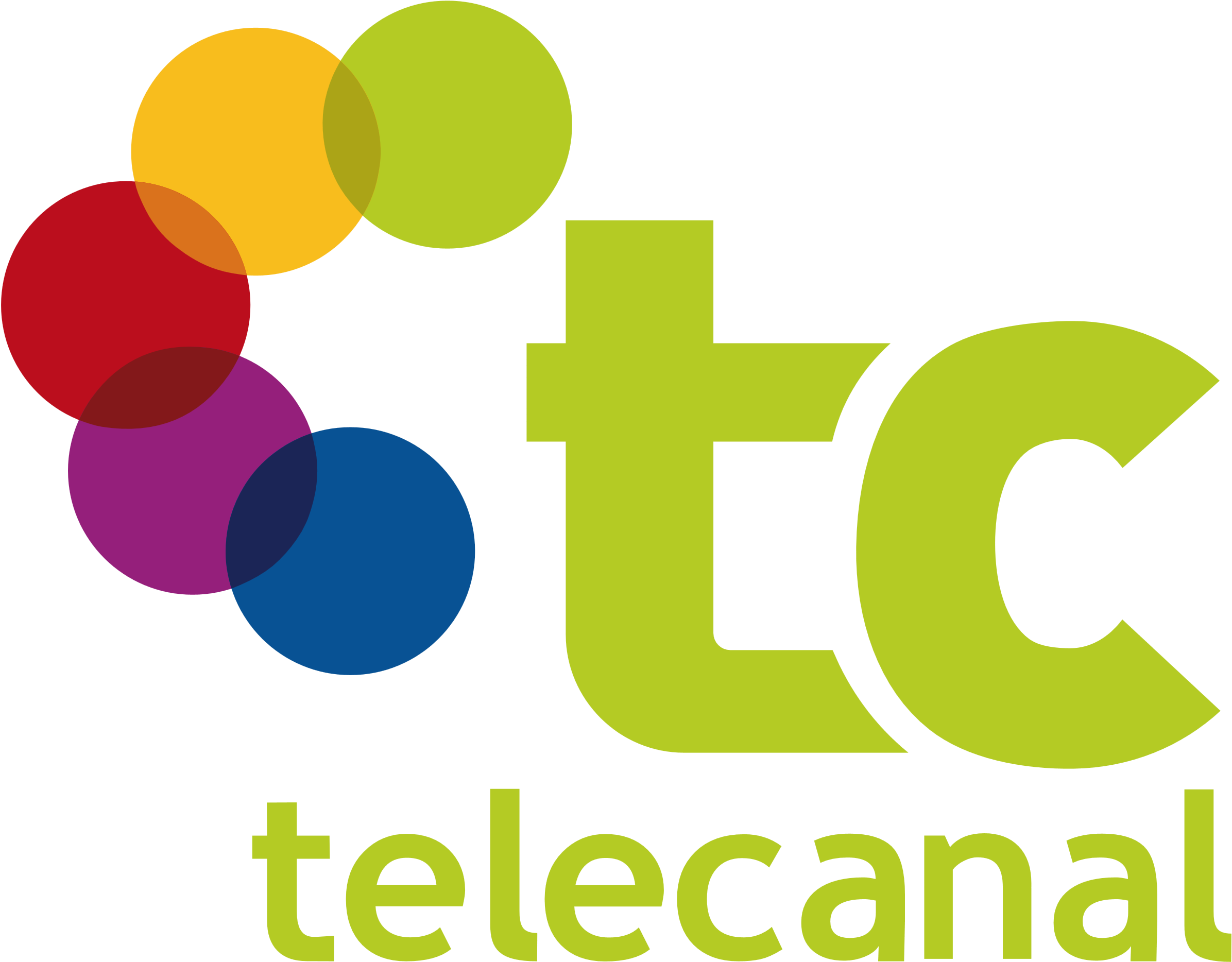
2007-2011
The former logo replaced the spheres by circles of the same colors as the previous logo, but one of the circles changes the orange to the lemon-green color (the same color as the letters). The letters tc remain lowercase, but occupy another typeface. The telecanal legend is the same color as the letters above with Trebuchet MS typography.
The current logo consists of the green letters T and C, the T appears cut by simulating a leaf, the other half remaining as an arch is positioned above the C. Below is the text "telecanal" with ITC Bauhaus Light typography with the motto "Tele" orange color and the motto "channel" green color.
CDR Central de Radios Radio Monumental | Zeta FM | Best FM | Exa | La Mejor | Momentos Reloj Radio Managua | Cristal 980 AM | Radio Pacífico | Radio Disney
Notes: 1Alongside all members of Anatel. 2Telenorte signed an affiliation to La Red in 1993, which lasted only one year as La Red expanded independently to the Chilean north. 3Joint-venture with Ibero Americana Radio Chile (PRISA Radio)
Former:Perú al Día | Maestra Vida | Afición Deportiva | Disco Nueve | Uno Más Uno | El Noticiero del Nueve | Documento | El Súper Show del Tío Ronco | El Pueblo Pregunta | La Semana | Domingos para la Juventud | La Olla | Lola es Siempre Lola | El Dedo | Telenovelas | Hits del Momento Musical | 123 | Esta Noche | Cabildo Metropolitano | Juntos Pero No Revueltos | Hits | Domingo Gigante | Fuego Cruzado) | 557 Magazine | Regresa | JB, el Imitador | Regina | La Perricholi | Dibujilandia | Las Mujeres de mi Vida | Bolero | En Directo | De Dos a Cuatro | Sinvergüenza | Travesuras con Monchi | Hora 25 | ATV Kids | Campaneando | 3,2,1...¡Juego! | Después del Fútbol | En Directo | De Colores | En Persona | Tiempo Real (Extra) | Pese a quien le Pese | Aquí y Ahora | Sin Censura | Pecado Original | Caiga Quien Caiga | Todo o Nada | Luna Negra | Sabor y Salsa | Loca TV | Gente Jo | El Show de Coco Giles | Piececitos | Gente que Busca Gente | Noches de Badani | El Mañanero Andino | Los Cincorregibles | El Equipo al Día | El Equipo de Goles | Los Cómicos de la Calle | Mónica | ATV Toons | Sarita Colonia | El Show del Mundial | Nuestro Negocio | Camino a la Fama | Red de Noticias | Creciendo con tu Bebé | Canto Andino | Karina y sus Amigos | Mango | Trato Hecho | Que Tal Mañana | Los Dumis | Condominio S.A. | Con Buena Onda | QTM Te Pone al Día | Fuego Cruzado | Laura en Acción | El Meridiano | Global Noticias | Ponte al Día con ATV | Hola a Todos | Chollyshow | Que Vivan las Mujeres | Mega Show | El Noticioso | Super Humor | Entre Peloteros | Laura para Todos | La Beca | El Peliculón | Dame Que Te Doy | Combate (El Origen del Origen | El Estelar del Humor | Diez | Hora Nueve | Trampolinazo | La Hora Macabra | El Cartel del Humor | #EsNoticia | Fábrica de Sueños | Peru's Next Top Model | Secretos de Telenovelas | Historias Secretas | A Todo o Nada | Atrapa el Millón | Mujeres Arriba | Sala de Espera | Aquí y Ahora | Cuéntamelo Todo | CNA-Central de Noticias ATV | La Revista Sábado | Beto a Saber | Segunda Opinión | Misión Rusia 2018 | ATV Espectáculos | Oe, ¿Es en Serio? | Mi Gente Dice: La Gala | Vivir Mejor
Noticias Al Día | En Contacto | +Deportes | +Q Noticias | Estación Central | Sin Rodeos | Punto de Vista | Medio Pasaje | Pasión por los Fierros | El Show de la Fé | Maestrísimo


")
")