Teleton 20-30 de Panamá is an annual 28-hour fundraising event created by Club Activo 20-30 de Panamá. Each telethon in Panama is released on the second (or third) Friday and Saturday of December at the Anayansi Theatre from the Atlapa Conventions Center. Since 1981, the event has been simulcast on various Panamanian television networks such as TVN, RPC, TVMax, Telemetro and NEXtv (which are also the official sponsors of the event).
This page only shows primary logo variants. For other related logos and images, see:
|
1981–1984 (first era)
")
")
")
")
From 1985 to 1989, the telethons were not released due to political and economic crisis in the country, as well as the forthcoming invasion.
1990–1999 (second era)
On 1990, the Activo 20-30 brought back the telethon to start their fifth edition of the event to focus on the so-called "goal projects" (which refers to hospital equipment improvements). The then new logo consisted of a solid red heart, a white ribbon with the event's name in blue Arial Black typeface and the Activo 20-30 logo placed on the upper left side of the heart.
Although the logo was mostly used during the 1990s, it was also used as an alternative for the 2000, 2001 and 2002 editions.
2000–2003
Starting in 2000, the Activo 20-30 unveiled a new modern version of the logo. This time the "white ribbon" variant is replaced by the event's name in a curvy-white-bold Century Gothic typeface, the domain site was added on the upper right side of the heart and the Activo 20-30 retains on the same place.
Nowadays, this logo still makes a surprise appearance on several large checks given from each sponsor in tandem with the 2004-2006 logo.
2004–2006
Starring in 2004, Activo 20-30 redesigned a newer version of the previous logo. This time the domain site has been dropped, the Activo 20-30 logo is now a bit smaller and the event's name is resized and changed to the Helvetica Neue Black Extended typeface.
For the 2005 edition, an animated loop of a spinning 3D model of the logo is shown for the first time on screen. Starting with that year to onwards, is used at the very start and end of the event as an intermission screen. An on-screen bug version of the logo is shown for the first time starting with the 2012 edition.
As same as the 2000-2003 logo, it also makes a surprise appearance on several large checks given from each sponsor.
2007

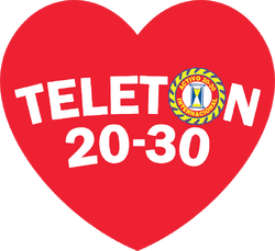
The Activo 20-30 logo is now placed on the "O" from the event's name, while the typeface is simply changed to Arial.
2008
A prototype version of the then 2009-2017 logo was unveiled for the 2008 edition. The name is now formed like an arc.
2009–2017
A slightly modified and notable version of the previous logo was unveiled for the 2009 edition. The heart has a dark gradient on the right side and the typeface is changed to Franklin Gothic Heavy. The logo was retained for eight years until its replacement with the current one, but it can still be in use by each sponsor.
2018–present
A new version of the logo was unveiled for the 2018 edition. This time the red heart has a cartoony appearance including another two or more hearts inside. The event's name now features the Aller Display typeface but in a smaller size. The familiar Activo 20-30 logo is now phased out from the heart for the first time in thirty three years.