This page only shows primary logo variants. For other related logos and images, see:
|
LS 82 TV Canal 7, (also known as Televisión Pública) is the oldest television network in Argentina created on October 17, 1951, and is owned by Radio y Televisión Argentina S.A.. The channel broadcast through Argentina via a series of repeaters and local channels who have contracts with Channel 7.
LR3 Radio Belgrano Televisión[]
1951–1959[]
1951–1953[]
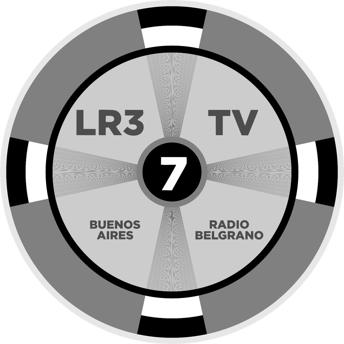
Channel 7 of Argentina began, as already mentioned, on October 17, 1951, as LR3 Radio Belgrano TV (referencing Radio Belgrano, which was responsible of its first broadcasts) and the first logo of the station was a television undercarriage of the time, in the rooms of the wheel the full name from the station and in the middle of them, the number 7 on a black circle.
1953–1955[]
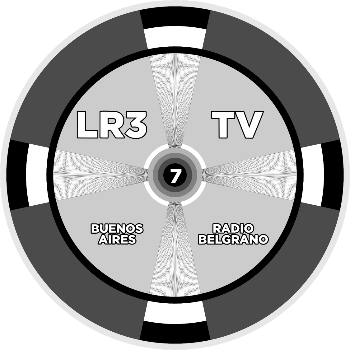
In 1953, a slight modification was made to the logo, the letters are now white with black edges, the edge of the wheel is a darker gray and the circle with the 7 appears surrounded by rings of black and white tones. In 1954, after the government of Juan Domingo Perón approved a controversial law, Radio Belgrano and its television station briefly became private and were transferred to an Sociedad Anónima called "Asociación Promotora de Telerradiodifusión", being the first time the station became private.
1955–1959[]
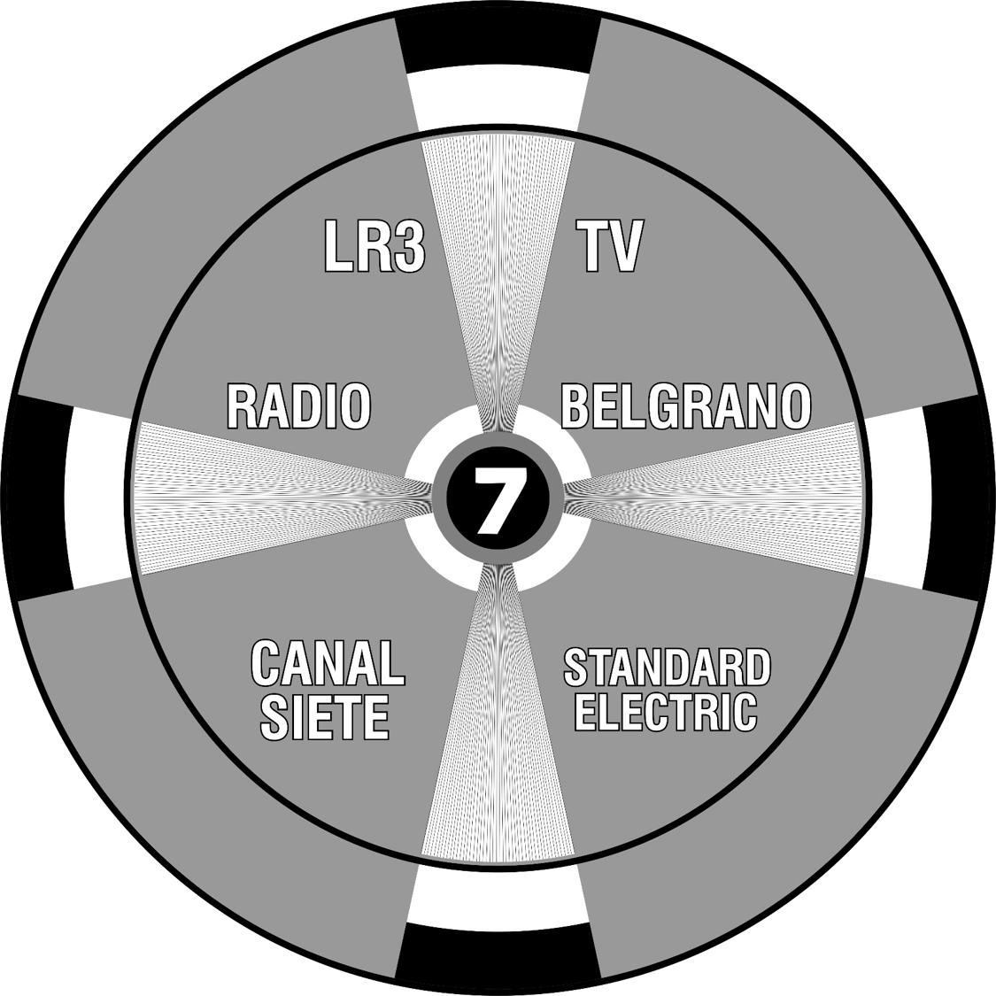
In 1955, probably coinciding with the September 16 coup d'état and the beginning of the Revolución Libertadora dictatorship (which turned Radio Belgrano and its station back into public assets), the logo was modified slightly, with the typography changed, with a resemblance to a real wheel and the words "CANAL SIETE" and "STANDARD ELECTRIC" are added.
1959–1961[]
In 1959, with the definitive nationalization of channel 7, the channel image was changed.
The logo resembles a compass containing the letters "CANAL" and "TV" and a seven with a black circle with a white border with needles.
Canal 7 (first era)[]
1961–1962[]
In 1961, the channel was renamed Canal 7 and the logo was the words "CANAL" and a "7" in gray Romans, all in 3D.
1962–1964[]
In 1962, the logo was modified, this time, with a "7" in the Roman typography and in 2D and to the left of the number, squares appear flowing in this and in one of them, the technical name of the channel appears.
1964, 1968-1969[]
In 1964, the logo was modified to a screen with triangles that form a "7" and above, the words "CANAL" and "Buenos Aires" on the sides.
1964–1965[]
In 1973, the channel name was modified to "CANAL 7" formed by dots and, below, the slogan "SU COMPAÑERO".
1965–1966[]
In 1965, the logo was changed to a text saying "canal siete" (with "siete" in the caricatured Roman typography) and below, the slogan of that moment.
1966–1967[]
In 1966, the logo changed to that of the letters "LS 82 TV CANAL" in black with the first two words bordered, on the right, a number "7" in Roman typography and on the right, the cartoon of the face of a smiling sorcerer.
1967–1970[]
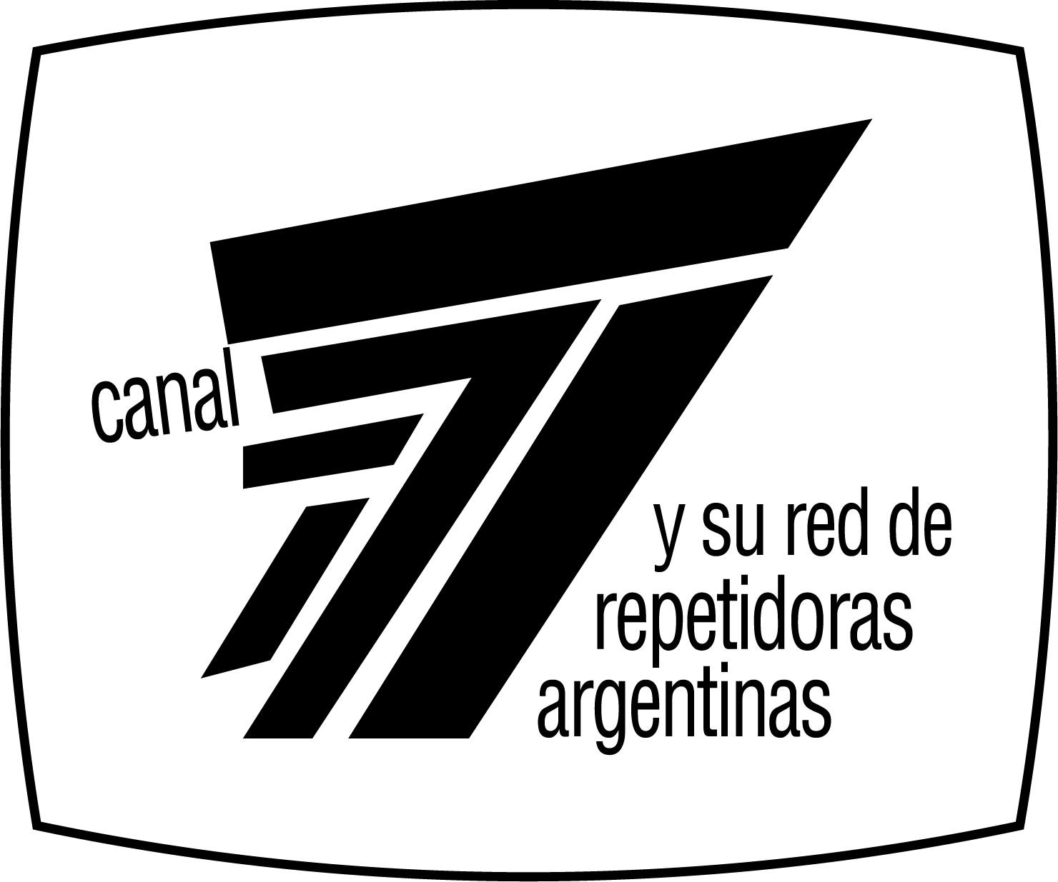
In 1967, the logo of a white screen with black borders was used, inside, a "7" formed by lines and on the sides, the letters "canal" and the phrase "y su red de repetidoras argentinas".
Televisión Argentina Canal 7[]
1967-1968; 1972-1974, 1975-1976[]
In 1967, the logo was changed to ten horizontal lines, and above it the name "canal 7" in Helvetica Black font.
1969-1972[]
In 1969, before the transition to color television, the logo became the word "channel" in Helvetica Bold font, on the right a number "7" in square Roman font, and at the bottom left the word " BUENOS AIRES".
1974-1975[]
In the 1974, the last logo of the then called Canal 7 was a "7" beveled by lines, above, the name "LS82TVCANAL7" and below, the name "TELEVISION ARGENTINA".
Canal 7 (second era)[]
1976-1979[]
This logo was used from 1976 (although there was a logo hiatus in June 1978) until early 1979 as a transitional logo between the Channel 7 name and the ATC name. This logo was a "7" formed by mirror-shaped lines, above and in 3D, the word "canal" and at the bottom right, the phrase "LS 82 TV, Buenos Aires, Argentina.
Argentina 78 Televisora/Centro de Producción a Colores Buenos Aires (A78TV)[]
June–July 1978[]
|
|
| Typography:
|
Custom-designed
Helvetica
|
|
|
This logo was only used during the 1978 World Cup made in Argentina, as Canal 7 assumed the broadcasting and distribution of that World Cup.
ATC (Argentina Televisora Color) (first era)[]
1979–1984[]
|
|
| Typography:
|
Custom wordmark
|
|
|
On May 3, 1979, the channel was renamed Argentina Televisora Color, also known by its acronym ATC, one of its many best known and remembered names, though ironically, the station did not begin color broadcasting until the following year. The logo was the letters "ATC" joined with a circle inside the "C", which resembles an eye, divided into dark green, dark purple, light purple, red, orange and yellow lines. In 1981, the colors were replaced with golden tones.
1984–1987[]
In 1984, the logo was changed to have a more futuristic appearance. The outline and appearance of the letters are now round and the color of the dark green line is bluish green, the purple line becomes light blue, and the light purple line becomes normal purple. This coincided with the transfer of the station into the Argentine Secretary of Culture.
1987–1996[]
In 1987, ATC left the Secretary of Culture and the logo changed again. The basic design of the 1979 logo is reused, but now it has diagonal cuts in the letters and the colored lines are now also diagonal, and the bars are now semi-dark yellow, semi-light orange, dark red, fuchsia, dark blue, light green and teal.
ATeCE[]
February–July 1996[]
In February 1996, the channel changed its name and logo to ATeCE (stylized phonetic reading letter-by-letter of ATC), with the colors of the flag of Argentina. This short-lived logo was designed by Orestes Lucero.
ATC (Argentina Televisora Color) (second era)[]
1996–1998[]
In July 1996, after the poor reception of the rebranding to ATeCE, the channel reverted to the 1987 logo.
1998–1999[]
In 1998, the logo is now together and with a gradient of yellow, red, blue and green.
January–April 2000[]
|
|
|
| Launched:
|
January 1, 2000
|
|
|
|
| Typography:
|
Futura Condensed
|
|
| Launched:
|
January 1, 2000
|
|
From January 1 to April 30, 2000, in the midst of the channel's restructuring, two logos were used, one with the name "Argentina Televisora Color" in Gill Sans font and another with the word "ARGENTINA TELEVISORA COLOR" in Futura Condensed font with a pair of thick lines surrounded on a black background.
Canal 7 (third era)[]
2000–2002[]
|
|
| Typography:
|
Highway Gothic (slightly modified)
|
|
|
On May 1, 2000, the channel took the name of Canal 7 Argentina and the new logo was an oval of blue colors with a white "7" in the form of a boomerang and below, the word "argentina" in blue.
2002–2003[]
|
|
| Typography:
|
Arial Bold ("canal")
Arial Black ("siete")
|
|
|
In March 2002, the logo was modified to a light blue screen-shaped border with six blue, orange, yellow, red, green and purple screens, and below, the name "canal siete" in black colors and yellow, with the last word in bold. This logo was also used in tandem with the next logo that was introduced later in 2002, until September 2003, when the channel restructuring was completed.
2002–2007[]
From late 2002 to the middle of 2003, the channel used this logo for many of its idents (the others, the previous logo). In September 2003, the channel dropped the previous logo, so this logo became the channel's main logo until 2007. This logo consists of a blue crystal-textured screen with a "7" of blue gradient color, and below, the name "canalsiete, Argentina".
TV Pública[]
2007–2009[]
2007–2008[]
In October 2007, the channel changed its name to Public TV and the logo was a red 3D "7" similar to Teletica with a pair of antenna waves on the sides and below., the name "tv.pública" in Helvetica typography, the last bold word.
2008–2009[]
Between 2008 and 2009, the antenna waves were omitted.
2009–2016[]
2009–January 2010[]
|
|
| Typography:
|
Fontana SC ("TV Pública")
Futura Bold ("CANALSIETE")
|
|
|
In February 2009, the channel leaves "7" and replaces it with an Argentine cockade of ice blue and white rings and the center of opaque orange. The name of the channel becomes a Fontana SC typeface with rounded edges and a semi-dark gray color and below, the name "CANALSIETE" in light gray color and in Futura Bold typography.
January–June 2010[]
|
|
| Typography:
|
Fontana SC ("TV Pública")
Futura Bold ("CANALSIETE")
|
|
|
In full transition to HD transmissions, the cockade now looks 3D.
June 2010–2014[]
|
|
| Typography:
|
Fontana SC ("TV Pública")
Unknown ("DIGITAL")
|
|
|
With the start of HD broadcasts, the channel will have a modified 3D appearance, the name of the channel is now in 3D and below, a black rectangle with a metallic border with the letters "DIGITAL" in yellow-orange and typography in the form of a clock.
2014–2016[]
Once the 2014 World Cup is over, the cockade now has a simplified 3D effect and below, the abbreviation of the channel name, "TVP", in gradient.
Televisión Pública Argentina[]
2016–2020[]
April 18, 2016, the channel changed its name to Televisión Pública Argentina and the logo is a new version of the cockade with diagonal divisions that differentiates the brightness and below, the name "TELEVISIÓN PÚBLICA" in Gotham Bold typeface and below, the word "ARGENTINA" in Gotham Light typography.
Televisión Pública[]
February–December 2020[]
|
|
|
| Launched:
|
February 22, 2020
|
|
On February 22, 2020, as part of a new restructuring, the logo omitted the word "ARGENTINA" from the name, renaming the channel to simply "Televisión Pública".
2021–present[]
| Designer:
|
Luciana Carlassara
Rogelio Riveros
Julieta Scagnet
|
|
|
| Launched:
|
January 1, 2021
|
|
On January 1, 2021, at midnight, Televisión Pública unveiled a new logo, one light blue ring circle with a yellow circle gathering with a dark blue color. This logo was first used on Argentina Global between 2019 and 2020.
After Javier Milei assumed as President of Argentina in December 2023, and following a controversial Necessity and Urgency Decree, Radio y Televisión Argentina was converted into an Sociedad Anónima and Televisión Pública (though ironically due to its name) became a station associated to it, being the second time the station becomes private.