No edit summary |
No edit summary |
||
| Line 4: | Line 4: | ||
|Tokyo2020 2015ImageTOC.svg|July–September 2015 |
|Tokyo2020 2015ImageTOC.svg|July–September 2015 |
||
|Tokyo2020 2016ImageTOC.png|2016 |
|Tokyo2020 2016ImageTOC.png|2016 |
||
| − | |Tokyo2020 2016ImageTOC.svg|2016–2021 |
+ | |Tokyo2020 2016ImageTOC.svg|2016–2021}} |
| − | }} |
||
The '''2020 Summer Olympics''' (officially the '''Games of the XXXII Olympiad''') and the '''2020 Summer Paralympics''', both commonly referred to as '''Tokyo 2020''', are two upcoming international multi-sport events that were scheduled to take place respectively from July 24 to August 9, 2020 and August 25 to September 6, 2020 in Tokyo, Japan. The games have been postponed until mid-2021, amidst the COVID-19 pandemic. The games are now scheduled respectively to be held from July 23 to August 8, 2021 and August 24 to September 5, 2021. |
The '''2020 Summer Olympics''' (officially the '''Games of the XXXII Olympiad''') and the '''2020 Summer Paralympics''', both commonly referred to as '''Tokyo 2020''', are two upcoming international multi-sport events that were scheduled to take place respectively from July 24 to August 9, 2020 and August 25 to September 6, 2020 in Tokyo, Japan. The games have been postponed until mid-2021, amidst the COVID-19 pandemic. The games are now scheduled respectively to be held from July 23 to August 8, 2021 and August 24 to September 5, 2021. |
||
==2011–2015, 2015–2016== |
==2011–2015, 2015–2016== |
||
===2011–2012 <small>Applicant City</small>=== |
===2011–2012 <small>Applicant City</small>=== |
||
| ⚫ | |||
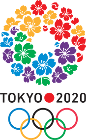
[[File:Tokyo 2020 Olympic bid applicant city logo.svg|center|175px]] |
[[File:Tokyo 2020 Olympic bid applicant city logo.svg|center|175px]] |
||
| ⚫ | |||
The official Olympic bid logo for Tokyo 2020 was unveiled on November 30, 2011 after a nationwide competition for an applicable design. The logo was created by [[Joshibi University of Art and Design]] student Ai Shimamine.<ref>[http://www.creativebloq.com/logo-design/tokyo-2020-olympics-logo-9134386 Creative Bloq - The story behind Tokyo's winning 2020 Olympic logo]</ref> |
The official Olympic bid logo for Tokyo 2020 was unveiled on November 30, 2011 after a nationwide competition for an applicable design. The logo was created by [[Joshibi University of Art and Design]] student Ai Shimamine.<ref>[http://www.creativebloq.com/logo-design/tokyo-2020-olympics-logo-9134386 Creative Bloq - The story behind Tokyo's winning 2020 Olympic logo]</ref> |
||
Revision as of 19:17, 25 July 2020
Template:Tokyo 2020
| 2011–2015, 2015–2016 | July–September 2015 | 2016 | 2016–2021 |
The 2020 Summer Olympics (officially the Games of the XXXII Olympiad) and the 2020 Summer Paralympics, both commonly referred to as Tokyo 2020, are two upcoming international multi-sport events that were scheduled to take place respectively from July 24 to August 9, 2020 and August 25 to September 6, 2020 in Tokyo, Japan. The games have been postponed until mid-2021, amidst the COVID-19 pandemic. The games are now scheduled respectively to be held from July 23 to August 8, 2021 and August 24 to September 5, 2021.
2011–2015, 2015–2016
2011–2012 Applicant City
|
|
|
The official Olympic bid logo for Tokyo 2020 was unveiled on November 30, 2011 after a nationwide competition for an applicable design. The logo was created by Joshibi University of Art and Design student Ai Shimamine.[1]
The emblem exhibits a wreath composed of cherry blossoms, a well-known floral symbol of Japan. It incorporates the blue, yellow, green and red of the Olympic Rings and purple, representing the Edo period (1603–1868). The circular shape represents diversity with each petal representing the importance and dependencies of the world's people with one another. According to an interview with Shimamine, the wreath was included as she saw that wreaths "carry a message of 'coming back again'." She saw the hosting of the Olympics as an opportunity to reinvigorate Japan through sport. The logo was accompanied by the bid motto Discover Tomorrow.
2012–2013 Candidate City
Tokyo was declared an official candidate for the 2020 Olympics on May 23, 2012. To reflect this move, the Olympic Rings were added to the bottom of the logo along with the words 'Candidate City'.
2013–2015, 2015–2016 Interim
Tokyo won the rights to host the games at the 125th IOC Session in Buenos Aires, Argentina. As such, the words 'Candidate City' was removed. This logo remained as an interim logo until the unveiling of the first version of its official emblem. This logo was reinstated in September 2015 as the organising committee took down the first design amid allegations of plagiarism.
During the process of the emblem's redrawing, the committee used a variety of placeholders for the upcoming emblem. They were the words 'Tokyo 2020' typed in a sans serif typeface.
July–September 2015
|
|
|
The first iteration of the games' emblems for both the Olympics and Paralympics were presented via a special event in Tokyo at 7pm of July 24, 2015; 5 years to the day before the Olympic opening ceremony.[2][3] The symbols were chosen from 104 submissions from across Japan.
Both the Olympic and Paralympic symbols were designed by Kenjiro Sano; a graduate of the Department of Graphic Design at Tama Art University and winner of many graphic design awards such as the New York ADC Gold Award and the Cannes Lions Gold.
The Olympic emblem explored the fundamental mission of the Olympic and Paralympic movements which are to unite the world through sport. This is shown through various means and techniques in these emblems.
- The 'T' shape of the emblem was inspired by the typefaces Didot and Bodoni whose highly serifed forms were seen by Sano as to have 'appealing strength and sensitivity'. It embodies the three themes of the emblem's design:
- Tokyo - the host city of the event and the meeting point of the world's athletes.
- Tomorrow - the ambition of the event to construct a better, more connected future for the world.
- Team - the entire world unites as one team.
- As black is the combination of all colours, the central pillar represents tolerance and diversity regardless of race, nationality or religion.
- The circle symbolises an all-accepting planet and its red colour represents a beating heart. It alludes to the Japanese flag, and the geographic position of Japan on the world map; in the top right corner.
- The circle re-enforced by the negative space of the two irregular triangles denotes an open, transparent world.
- The use of gold in the top left triangle pays homage to the last summer games held in Tokyo in 1964.
The Paralympic emblem was similar to its Olympic counterpart, but has two black pillars positioned to the sides as opposed to one in the centre. The two pillars represent the equal sign '=', showing the Paralympics as an event which shares the same ideals as the Olympics and holds Paralympians to the same standards of the Olympic Games. It may also be interpreted as the Roman numeral for 2, which represents the second time Tokyo plays host to the Paralympics and in inclusion, the only city at the point of writing to host the Olympics and Paralympics in the same year twice.
Reactions to the logos were mixed; some praised its simplicity and clever symbolism while others had more critical views on the basis that it was bland and not fit for a sporting event. Many were mystified by the use of Clarendon as the main typeface. Some observers spotted that it looks similar to the logo of the J.League; the top-level Japanese football league.
After the designs were unveiled, allegations arose that the emblem was plagiarising the logo for Théâtre de Liège, a Belgian performance arts studio.[4] Olivier Debie, the creator of the theatre's logo claimed that the Tokyo 2020 emblem was too similar to his own work and was considering action against the organising committee. Even though the theatre's logo wasn't registered as a trademark, he still insists the emblem was a work of plagiarism as it's been available online for two years. The design also was accused of plagiarising from a poster conceived by Hey Studios in Barcelona, Spain created during the rebuilding of Japan after the 2011 tsunami. The studio stated they "...would be proud if it inspired an emblem for a major event, but it was probably a coincidence."
On August 5, 2015, Kenjiro Sano responded by saying that he had never seen the design Debie claimed, and added that he had never or would never plagiarise any design.[5] He stated that "Of course I didn't take [Debie's logo] as an example, there is absolutely nothing to that talk.". An official response on the logo from the Japanese Olympic Committee was issued on August 29 stating that they still see the emblem as a piece of original work as "it has many characteristics that are not present in Liege's logo,".
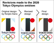
Revisions of the Olympic emblem
Officials took the unusual step of unveiling Sano’s initial blueprint, saying its emphasis on the “T” shape bore no resemblance to Debie’s theatre design.
Sano also came under fire for using photos from multiple online sources without seeking the permission to do so first. They were manipulated to showcase the use of the emblems on the side of buildings and their interiors during the event. The pictures he used were sourced from blogs and commercial websites, but he had not sought out official permission to use those assets prior to the project photos being made publically available.
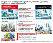
Breakdown of the image sources
Further concerns arose about the emblems after a number of plagiarism claims emerged on other designs created by Sano. His office requested beverage company Suntory pull several tote bag designs for a beer brand, stating that designers had traced those designs "from a third party". The Higashiyama Zoo and Botanical Gardens began an investigation of their current logo from 2012 and designed by Sano after comments that it closely matched the logo of the National Museum of Costa Rica. American artist Josh Divine claimed that Sano's logo for a museum/library in Ota, Gunma Prefecture is similar to a design of his own.[6]
The committee continued to defend Sano's work, but became inundated with pressure to pull the design following the multiple plagiarism claims against Sano.
“We became aware of new things this weekend and there was a sense of crisis that we thought could not be ignored. (...) We have decided that the logo cannot gain public support”
|
— Tokyo 2020 Organising Commitee
|
Its retraction was also requested by Sano himself saying that he feels the controversy was beginning to damage the reputation of the Tokyo games and that his own reputation was under threat. They conceded that this emblem had become a PR disaster and came to the conclusion to retire it just over a month after it had been instated.
On September 2, 2015, the emblems designed by Kenjiro Sano were officially scrapped.[7] The official website and social media channels have reverted to using the interim emblem by Ai Shimamine for the period until a new emblem can be selected. On January 27, 2016, Debie stated that he will drop the suit against the organising committee, citing the mounting legal costs.
2016
Public Redesign Contest
| SVGS NEEDED |
The organisers established a separate committee in September 2015 to select a new emblem for the Tokyo Olympics and Paralympics, consisting of athletes, design experts and Japanese sports personnel.[8] Among the responsibilities of the committee are to consider the events leading the former emblem's withdrawal and make policies to judge future emblem designs.
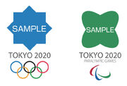
Template found on website during the submission process
The new logo was decided by the committee as part of an open competition among Japanese citizens and residents to create the new logo. The submission period ran from November 24 to December 7, 2015. 14,599 submissions were received within the 2 week period; 12,900 of which came from individual designers and primary school students with participant ages ranging from 12 months to 107 years old.[9] Strict copyright checks were conducted by the IOC on all designs and the committee. The shortlist was revealed at the Toranomon Hills Mori Tower on April 8, 2016.[10]
2016–2021
Emblems
|
|
|
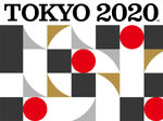
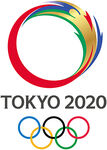
On April 25, 2016, the revised emblems for the games were announced as Candidate A: harmonized chequered emblem.[11] The emblem was designed by Asao Tokolo, a Tokyo Zokei University graduate artist born in 1969. He previously had had several exhibitions in local museums like the Museum of Contemporary Art Tokyo and the NTT InterCommunication Center in Tokyo. The emblems will last for 5 years until 2021 as the games were moved to mid-2021.

Winner unveiling on 25 April 2016
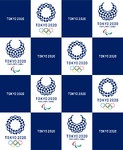
The emblems both consist of 45 boxes of three varying ratios arranged into a wreath shape. 'Tokyo 2020' and 'Paralympic Games' are written in a narrow variant of DIN. In some ways, the emblems resemble Ai Shimamine's bid logo from 2011, both using the circular mosaic shape and DIN as the typeface.

Asao Tokolo posing with his winning design at the announcement ceremony
The checkered pattern is a common design among many cultures, as well as in Japan where it was referred to as “ichimatsu moyo” in the Edo period. Each of the boxes represents different nations, varying in culture, size and thoughts showcasing "unity in diversity". It unifies the nations using the Olympics as a platform to promote peace. The emblems are set in an indigo-like blue colour expressing the elegance and sophistication which Japan is renowned for.
“My mind has gone blank as I just found out my design won... I put a lot of time and effort into this design as though it was my own child”
|
— Asao Tokolo[12], designer of the emblem, to Associated Press
|
Slogan
The official Games slogan was unveiled on the February 17, 2020 in a promotional video released by the organising committee.[13] The official slogan is "United by Emotion"; an phrase which calls on sport's unique ability to unify people from all walks of life as a common interest. The motto itself will be presented only in English.
Typography
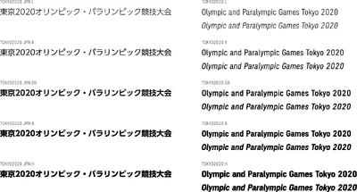
The official font of the Games was first implemented in 2018 and was created by Japanese typography firm Morisawa.[14] Morisawa was involved with the previous Tokyo Olympic Games in 1964, as they developed the on-screen presentation or "TELOP" system for the games. In their current capacity, they operate as a type foundry that specialises in Universal Design fonts.
What Morisawa aims to achieve with the development of the font was to encourage the adoption of Universal Design philosophies across society. This attitude is best encapsulated by the phrase taken from an internal memorandum within the company; "A Stirring Moment Preserved Forever through Typography".
The philosophies of Universal Design were central to the creation of the Tokyo 2020 typeface, a neutral font with minimal flourishes and optimal readability. The font itself consists of a standard Pr6 Kanji layout of 23,058 characters, 300 standard Latin characters and various other characters. They saw the Latin characters as fundamental to the font's success as a whole, so they worked closely with Morisawa employees in the United States to craft them. Kanji characters were designed to appear closer to handwritten shapes to aid in recognition. They also eliminated loose ends on strokes to retain a balance between positive and negative space.
Medals
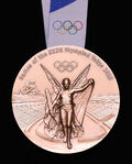
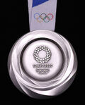
The Tokyo 2020 Olympic medals were unveiled at a special '1 Year To Go' event on the July 24, 2019 at the Tokyo International Forum. They were designed by Junichi Kawanishi; a representative for Japanese wayfinding firm SIGNSPLAN and a director of both the Japan Sign Design Association and Osaka Design Society.[15] In a first for any Olympic or Paralympic Games, the entirety of the event's 5,000 medals were created with materials only sourced from recycled electronic devices, donated by Japanese citizens.
The obverse side of the medal has a design common to modern era Olympic medals. Central to the design is a depiction of Nike; the Greek goddess of victory in front of the Panathenaic Stadium in Athens, where the first modern Olympic Games held in 1896. The design is flanked with the Olympic Rings and the text "Games of the XXXII Olympiad Tokyo 2020". The name of the event in which the athlete(s) won the medal is embossed on the medal's rim.
The reverse design is made to be reminiscent of rough stones which have been extensively polished. It's made to reflect the dedication that athletes adhere themselves to in their training in order to attain glory, especially in such a high-level event. The uneven textures of the medal make it glow in varying shades, depending on its relation to a light source. The "myriad patterns of light" as they are referred to are meant to represent the energy of athletes and those that support them.
The medal ribbon has a design consistent with the Look of the Games. The ribbons also have silicone lumps stamped into them, which allow people to distinguish the three medal types by feel. Each medal comes with a wooden case coloured in the signature blue hue of the games and are emblazoned with the event emblem. Each case is uniquely crafted and has its own natural wooden texturing.
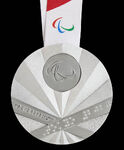
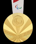
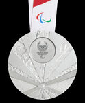
The designs for the Tokyo 2020 Paralympic medals were unveiled on August 25, 2019 at a special event at Tokyo's NHK Hall one-year from the Opening Ceremony. The medals were designed by Sakiko Matsumoto[16], a graduate of the Department of Fine at Arts Tama Art University. The Paralympic medal design revolves around the traditional Japanese fan, creating a gust of wind that will refresh the world and give its people a shared experience, using the Paralympic Games as a medium.
The obverse side features the Paralympic Agitos prominently in the above-center circle, the text "Tokyo 2020 Paralympic Games" in English and "Tokyo 2020" in braille. The obverse side of the medal displays the event emblem in full within the circle. Alternating folds of the fan show five elements of the Japanese landscape; rock, flowers, leaves, water and wood. The pivot joint or "kaname" of the fan depicts the city and arenas in which the world's Para athletes will converge and mix. On the rim of the medal, the name of the event to which the medal is awarded is embossed in English, as well as indented dots marking the medal type (one for gold, two for silver, three for bronze). These act as sensory aids for sight-impaired athletes and are a new feature amongst Paralympic medals.
Like the Olympic medals, the Paralympic medal are attached to a ribbon similar to that of the Olympic variation and are accompanied by a wooden case. Unlike the Olympic medal however, the case itself also comes with a string bag.
Torches & Torch Relays
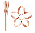
On March 20, 2019, the organising Committee unveiled the torch and Torch Relay emblem at a press conference in Tokyo. The designer of the torch, cauldron and lantern was Tokujin Yoshioka, a designer who works in the fields of architecture and contemporary art and specialises in the theme of nature.
The torch is inspired by the shape of the Olympic Flame and of the cherry blossom; widely considered Japan's national flower. The start of the relay also coincides with the start of the cherry blossom season in Japan. The housing was constructed from 30% recycled steel, previously used as part of temporary housing in the aftermath of the 2011 Great East Japan Earthquake. Its manufacturing utilises the same aluminium extrusion methods that was used to build the Shinkansen (bullet train). The torch housing altogether is produced from just one sheet of aluminium and weighs just 1 kilogram. The cauldron is designed similarly to the torch, and both it and the lantern are composed from recycled aluminium.
On March 25, 2019, five days after the Olympic Torch Relay event, the Paralympic torch and Paralympic torch relay logo were also unveiled. The Paralympic torch is near-identical to the Olympic torch, but is emblazoned with the Paralympic emblem and is Sakura pink as opposed to rose gold.
The Olympic Torch Relay logo contains three vermilion rectangles, consistent with those from the event logo. The rectangles have a gradient effect towards the top-right edges to emulate the look of a flame. The gradient also implements a traditional method of woodblock printing or "ukiyo-e" called Fukibokashi. The ochre curvature represents the vast expanses of land that the torch and its flame will travel across during the relay.
The Paralympic relay logo is similar to its Olympic counterpart, but three shades of yellow and an different ochre curve.
Hope Lights Our Way
Mascots
In 2017, the Tokyo 2020 Organising Committee held a competition to design the 2020 mascots. The process was reduced to three shortlists of two mascots in late-October 2017. The winning candidate was Pair A (created by Ryo Taniguchi) and were announced on February 28, 2018. The mascots were given names on July 22, 2018. The mascots final names were: Miraitowa named after the Japanese words for "Future" and "Eternity" and Someity named after the yoshino type of cherry blossom and also the English phrase, "So mighty".
Nippon Festival
| SVG NEEDED |
The Nippon Festival is the primary cultural showcase held prior to beginning of the Olympic and Paralympic Games. The 'festival mark' was created by Asao Tokolo; the game emblems' creator, and is derived from the same 3-box structure of the logos. The mark itself depicts three crescent shapes intersecting into a central point. The mark deviates slightly from the games emblems by being multicoloured, using pink, yellow, teal, blue and the indigo blue of the emblems.
To accompany the mark, algorithmic designer Shohei Matsukawa created a system which can generate different variations of the emblem on a flat plain or sphere. The system makes up much of the festival's visual identity.
Blooming of Culture
Official Posters
On January 7, 2020, the Organising Committee revealed 20 official posters for the Games, created by a mixed of local and international artists. The posters were placed on public display in an exhibition at the Museum of Contemporary Art Tokyo.
March 2020 Postponement
On March 24, 2020, Japanese Prime Minister Shinzo Abe and the International Olympic Committee announced that the Olympic and Paralympic Games will officially be postponed and will be held in 2021.[17] This is a first for the games; which had previously been cancelled during wartime, but never postponed.
Despite the rescheduling of the events, the event will retain its current branding in full and continue to be promoted as 'Tokyo 2020'.
| SVG NEEDED |
On July 23, 2020, the organising committee staged a brief '1 Year To Go' message. They acknowledged the pandemic, the efforts of medical staff to contain it and how it impacted day-to-day life; case in point, the Olympic and Paralympic Games, which were supposed to begin the following day. During the message, they presented a graphic used in tandem with the event wordmark, a handwritten '+1', highlighting that the event will take place in 2021. The graphic was also accompanied by the phrase 'One Step Forward'.
See also
Notes and references
- ↑ Creative Bloq - The story behind Tokyo's winning 2020 Olympic logo
- ↑ International Paralympic Committee - Tokyo 2020 launches emblems for the Olympic and Paralympic Games
- ↑ Brand New - New Logo for the 2020 Summer Olympic Games by Kenjiro Sano
- ↑ The Guardian - Tokyo Olympic Games logo embroiled in plagiarism row
- ↑ Reuters - 'No truth' to plagiarism claims: Tokyo 2020 logo designer
- ↑ The Japan Times - Tokyo Olympics logo designer faces fresh plagiarism claim from U.S. artist
- ↑ The Guardian - Tokyo 2020 Olympics logo scrapped after allegations of plagiarism
- ↑ Tokyo 2020 - Tokyo 2020 Emblems Selection: The Organising Committee Announces the Establishment of a Preliminary Committee
- ↑ Bangkok Post - Tokyo 2020 gets new logo proposals after plagiarism scandal
- ↑ Inside the Games - Tokyo 2020 to reveal replacement logo contenders on April 8
- ↑ Tokyo 2020 - Games Emblems
- ↑ Gizmodo - The New Tokyo 2020 Olympics Logo Hopefully Isn't a Rip-Off
- ↑ Tokyo 2020 - "United by Emotion" to be the Tokyo 2020 Games Motto
- ↑ Tokyo 2020 - "A Stirring Moment Preserved Forever through Typography": Morisawa - the provider of the official font for the Tokyo 2020 Games
- ↑ Tokyo 2020 - Tokyo 2020 Olympic Medal
- ↑ Tokyo 2020 - Tokyo 2020 Paralympic Games Medal
- ↑ Joint Statement for the International Olympic Committee and the Tokyo 2020 Organising Committee - International Olympic Committee
External links
- Tokyo 2020
- International Olympic Committee - Tokyo 2020
- Japanese Olympic Committee
- Architecture of the Games - Tokyo 2020
|
|


