| 1940–1954 | 1954–1961 | |||||
| 1930–1933 | 1933–1935 | 1935–1939 | 1939–1940 | 1940–1954 | 1954–1961 | 1960–1961 |
| 1974–1993 | 1993–1998 | |||||
| 1961–1974 | 1974–1993 | 1993–1998 | 1998–2010 | 2010 | 2010–present | |
1930–1933

1933–1935

1935–1939

1939–1940
1940–1954
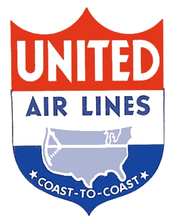
This logo was introduced in the early 1940s.[2] It was a simplification of an earlier shield logo, first introduced in 1936.
1954–1960
Around the early 1950s, the shield logo was altered when a slight slant was added.
1960–1961

Yet another change came around the early 1960, when United merged with Capital Airlines. The word "United" was made bigger, and the rest of the name disappeared from the icon.[3]
1961–1974

An oblique vertical "spike," blue on bottom and red on top, running through the name "United" written in a black or blue serif italic font.
")
")
1974–1993

In September 1974, United introduced a new logo designed by famed logo creator Saul Bass.[5] The logo features a stylized U that is slanted by 68 degrees. It is sometimes nicknamed "the tulip".
")
")
1993–1998
United received a new image in 1993 from CKS Partners.[6]
")
1998–2010
During 1998, United started implementing a new identity, created by Pentagram.
")
")
")
")
May-October 2010

In 2010, United acquired Continental Airlines in a merger that will be completed later that year. Inititally, the entities remain separate, with United continuing to use a variant of the slant U logo. The logo and livery was presented with the merger on May 3 and keeps most aspects of Continental's identity, but replaces the Continental name with United.
")
October 2010–present
The initial merger identity was replaced after only three months. On August 11, 2010, a tweaked logo and livery was revealed. Yet the logo now only has the word "United" on it and it is written in capital letters using a simple sans serif font.[8][9][10]
The merger was officially completed on October 1, 2010.[12]
External links