Newdiscoveries (talk | contribs) No edit summary |
Newdiscoveries (talk | contribs) |
||
| Line 96: | Line 96: | ||
File:Walmart 50.svg|50th Anniversary logo (2012) |
File:Walmart 50.svg|50th Anniversary logo (2012) |
||
Walmart==_Star_Wars-_The_Force_Awakens.PNG|''[[Star Wars: The Force Awakens]]'' variation (December 2015) |
Walmart==_Star_Wars-_The_Force_Awakens.PNG|''[[Star Wars: The Force Awakens]]'' variation (December 2015) |
||
| − | File:7003615700_703798e532_z.jpg|Updated logo for Walmart Supercenters, though this logo has been phased out on newer supercenters, now being branded simply Walmart. |
+ | File:7003615700_703798e532_z.jpg|Updated logo for Walmart Supercenters, though this logo has been phased out on newer supercenters, now being branded simply Walmart.<br/>{{SVG needed gallery}} |
</gallery> |
</gallery> |
||
Revision as of 02:58, 23 December 2019
| 1950–1962 | ||||||
| 1950–1962 | 1962–1964 | 1964-1981 | 1981–1992 | 1991 (prototype) | 1992–2008 | 2008–present |
Walton's Five and Dime
1950–1962
| SVG NEEDED |
The Walmart founder Sam Walton named his first store Walton's Five and Dime. The name changed due to a lease of a previous franchise expiring.
Walmart (first era)
1962–1964
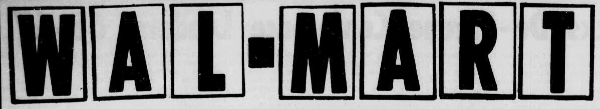
Sam Walton named his new stores Walmart. The Walmart name was presented in just about any front/style available to the printer.
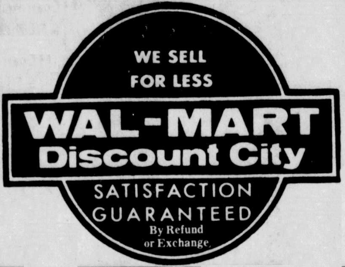
Wal-Mart Discount City
1964–1969

1965–1967

1967–1968
1968–1970
1969–1975
1970–1975
1975–1977

First used as an alternate logo only used occasionally in the early seventies, it began being more commonly used around late 1975, when it became the official logo. It was first used in print as the corporate logo on November 24, 1975.
1977–1981

In mid-1977, the "R" and hyphen were largely modified.
1977–1981 (alternate)
Wal-Mart
1981–2008
1981–1992
In 1981, the Wal-Mart logo changed color to brown, the "Discount City" logo was completely dropped, and the font was changed as well. This was reused in Canada in 1994 which was colored blue to match its American counterpart, until it switched to its usual logo in 2001.
1991 (prototype)

| SVG NEEDED |
In 1991, Wal-Mart rolled out several prototype locations using a logo with a star instead of a hyphen and an entirely different typeface. This logo was only used on storefronts (all now closed or remodeled) and a small amount of in-store branding.
1992–2008
In 1992, Wal-Mart changed logo color to blue and replaced the hyphen with a star. This is still used on semi-trucks and some stores, however many are replacing it with the new logo below. One store in Arlington, Maryland still used this logo until 2018.
Walmart (second era)
2007–present (logo); 2008–present (wordmark)

A new logo with a new font was first used in late 2008. It was decided that only the W would be upper-case and the rest would be lower-case. The yellow 'spark' or 'sunshine' on the logo was introduced in September 2007 on semi-trucks and the company's website, as well as the slogan and light blue color; however, the wordmark was not introduced until a year later.
")
")
Other
2008-present
")
")
See also
External links
Walmart
|
|---|
| Retail outlets: North America: South America: Asia: Africa: Consumer brands: Other assets: Former assets: Notes |