MarvyTheMan (talk | contribs) |
Jackson101306 (talk | contribs) No edit summary |
||
| (40 intermediate revisions by 18 users not shown) | |||
| Line 13: | Line 13: | ||
|Warner Bros. 1970.jpg|1970–1972 |
|Warner Bros. 1970.jpg|1970–1972 |
||
|Warner W.svg|1972–1990 |
|Warner W.svg|1972–1990 |
||
| − | |Warner Bros. Pictures.svg| |
+ | |Warner Bros. Pictures.svg|1993–present |
|Warner Bros. Pictures 2019.svg|2019–present |
|Warner Bros. Pictures 2019.svg|2019–present |
||
}} |
}} |
||
| + | |||
| ⚫ | |||
| + | ==Warner Brothers Classics Of The Screen== |
||
===1923–1925=== |
===1923–1925=== |
||
[[File:Warner Bros. Classics.png|center|300px]] |
[[File:Warner Bros. Classics.png|center|300px]] |
||
| + | The first logo of Warner Bros. Pictures was introduced on April 4, 1923. Before the 1925 update, this logo was used as a primary logo until the same year. |
||
| + | ==Warner Brothers Productions== |
||
===1925–1929=== |
===1925–1929=== |
||
[[File:Warner Bros. 1923.png|center|150px]] |
[[File:Warner Bros. 1923.png|center|150px]] |
||
| − | |||
| − | {{SVG needed}} |
||
| − | |||
This is the very first Warner Bros. shield logo, nicknamed the "Brain Shield". The top half of the shield included a photo of the exterior of the their original studio building, with the "WB" initials occupying the bottom half, separated by a small dash. The title card with this version of the logo originally included the text "A Warner Brothers Classic of the Screen", which was later replaced with "A Warner Brothers Production" in 1926. |
This is the very first Warner Bros. shield logo, nicknamed the "Brain Shield". The top half of the shield included a photo of the exterior of the their original studio building, with the "WB" initials occupying the bottom half, separated by a small dash. The title card with this version of the logo originally included the text "A Warner Brothers Classic of the Screen", which was later replaced with "A Warner Brothers Production" in 1926. |
||
| + | ==Warner Bros. Pictures Inc.== |
||
| − | |||
===1929–1937=== |
===1929–1937=== |
||
[[File:WB1935.jpg|center|200px]] |
[[File:WB1935.jpg|center|200px]] |
||
| Line 33: | Line 33: | ||
{{SVG needed}} |
{{SVG needed}} |
||
| − | This was the first logo design in which the "WB" letters filled the whole shield |
+ | This was the first logo design in which the "WB" letters filled the whole shield. There are two different types of the lettering "WARNER BROS. PICTURES, Inc.". This logo was also used on [[Looney Tunes]] and [[Merrie Melodies]] cartoons. |
===1935–1937=== |
===1935–1937=== |
||
[[File:Warner Bros. 1937.svg|center|150px]] |
[[File:Warner Bros. 1937.svg|center|150px]] |
||
| + | In 1935, this variant was used as the "Zooming W-B Shield". This logo was used on ''Looney Tunes'' and ''Merrie Melodies'' cartoons until 1937. |
||
===1937–1967=== |
===1937–1967=== |
||
[[File:WB1937.gif|center|200px]] |
[[File:WB1937.gif|center|200px]] |
||
| − | |||
| − | {{SVG needed}} |
||
| − | |||
In 1937, a banner was added onto the shield reading the company's full name ("WARNER BROS. PICTURES INC.") for the first time, a design that would resonate within many of its subsequent logo designs. |
In 1937, a banner was added onto the shield reading the company's full name ("WARNER BROS. PICTURES INC.") for the first time, a design that would resonate within many of its subsequent logo designs. |
||
| ⚫ | |||
===1948–1967=== |
===1948–1967=== |
||
[[File:Warner Bros 1950s print.png|center|150px]] |
[[File:Warner Bros 1950s print.png|center|150px]] |
||
{{SVG needed}} |
{{SVG needed}} |
||
| + | In 1948, the WB shield was introduced to resemble a shield without the banner. |
||
| − | === |
+ | ===1953–1967, 1970–1972, 1985–2019=== |
[[File:Warner Bros..svg|center|180px]] |
[[File:Warner Bros..svg|center|180px]] |
||
| − | After its introduction at the end of the 1953 film ''Hondo'', this logo was slightly modified to be used as a print logo for film trailers and other stationary media. After it was discontinued in 1972, it was later reintroduced on promotional materials in 1985 |
+ | After its introduction at the end of the 1953 film ''Hondo'', this logo was slightly modified to be used as a print logo for film trailers and other stationary media. After it was discontinued in 1972, it was later reintroduced on promotional materials in 1985 until it was discontinued again in 2019. With a total run of 52 years, this is the longest-lived logo used by the company. |
==Warner Bros.-Seven Arts== |
==Warner Bros.-Seven Arts== |
||
| Line 59: | Line 59: | ||
In 1967, for the first time in WB history, the text "WB" was nowhere to be found on the logo; instead, the symbol "W7", symbolizing its merger with [[Seven_Arts_Associated_Corporation|Seven Arts]], appeared. |
In 1967, for the first time in WB history, the text "WB" was nowhere to be found on the logo; instead, the symbol "W7", symbolizing its merger with [[Seven_Arts_Associated_Corporation|Seven Arts]], appeared. |
||
| − | ==Warner Bros., Inc.== |
+ | ==Warner Bros., Inc./Warner Bros.== |
===1970–1972=== |
===1970–1972=== |
||
[[File:Warner Bros. 1970.jpg|center|200px]] |
[[File:Warner Bros. 1970.jpg|center|200px]] |
||
| − | |||
| − | {{SVG needed}} |
||
This logo was once superimposed over one of the backgrounds used for the 1948 logo that would later be used for the 1984 logo. This was used during the period Warner Bros. when was owned by Kinney National Company; that firm's name would sometimes appear inside the rectangular block in place of "Warner Bros." in this logo. |
This logo was once superimposed over one of the backgrounds used for the 1948 logo that would later be used for the 1984 logo. This was used during the period Warner Bros. when was owned by Kinney National Company; that firm's name would sometimes appear inside the rectangular block in place of "Warner Bros." in this logo. |
||
| Line 70: | Line 68: | ||
Famed logo designer [[Saul Bass]], also responsible for the [[Geffen Pictures|Geffen]] "G" and the [[United Airlines]] logos of the 1970s, created this logo, which was very unpopular in its time. In the commentary on the DVD of the movie ''[[Gremlins]]'', which brought back the shield logo, director Joe Dante notes that this logo was designed to be more artsy. When the movie was made, Dante knew that it was going to have the classical feel of the classic Warner Bros. movies because of them shooting on the Warner lot and that Jerry Goldsmith was doing the music. So, they decided to bring back the shield logo and the studio loved it and they brought it back for their future movies. However, this is still used as a logo today for other Warner properties (mainly by the now-unrelated [[Warner Music Group]]), and the stylized typeface was used for WB's home video division from 1978 to 1996. |
Famed logo designer [[Saul Bass]], also responsible for the [[Geffen Pictures|Geffen]] "G" and the [[United Airlines]] logos of the 1970s, created this logo, which was very unpopular in its time. In the commentary on the DVD of the movie ''[[Gremlins]]'', which brought back the shield logo, director Joe Dante notes that this logo was designed to be more artsy. When the movie was made, Dante knew that it was going to have the classical feel of the classic Warner Bros. movies because of them shooting on the Warner lot and that Jerry Goldsmith was doing the music. So, they decided to bring back the shield logo and the studio loved it and they brought it back for their future movies. However, this is still used as a logo today for other Warner properties (mainly by the now-unrelated [[Warner Music Group]]), and the stylized typeface was used for WB's home video division from 1978 to 1996. |
||
| − | ==Warner Bros. Pictures (second era)== |
+ | ==Warner Bros. Pictures <small>(second era)</small>== |
| − | === |
+ | ===1993–present=== |
[[File:Warner Bros. Pictures.svg|center|200px]] |
[[File:Warner Bros. Pictures.svg|center|200px]] |
||
| − | In 1993, the banner "Warner Bros. Pictures" was re-added to the shield, resembling the |
+ | In 1993, the banner "Warner Bros. Pictures" was re-added to the shield, resembling the 1948 and 1984 logos. It was used as the corporative logo of the company for 26 years until the rebrand in 2019, altought its [[Warner Bros. Pictures/On-screen Logos|on-screen variants]] are still used. |
===2019–present=== |
===2019–present=== |
||
[[File:Warner Bros. Pictures 2019.svg|center|175px]] |
[[File:Warner Bros. Pictures 2019.svg|center|175px]] |
||
| ⚫ | |||
| − | |||
| ⚫ | |||
==Note== |
==Note== |
||
| Line 104: | Line 101: | ||
[[Category:AT&T]] |
[[Category:AT&T]] |
||
[[Category:AOL]] |
[[Category:AOL]] |
||
| + | [[Category:Warner Bros. Family Entertainment]] |
||
Revision as of 06:57, 1 August 2020
- "Warner Bros." redirects here.
This page only shows primary logo variants. For other related logos and images, see:
|
| 1923–1925 | 1925–1929 | 1929–1937 | 1935–1937 | 1937–1967 | 1948–1967 |
| 1953–1967, 1970–1972, 1985–2019 | 1967–1970 | 1970–1972 | 1972–1990 | 1993–present | 2019–present |
Warner Brothers Classics Of The Screen
1923–1925
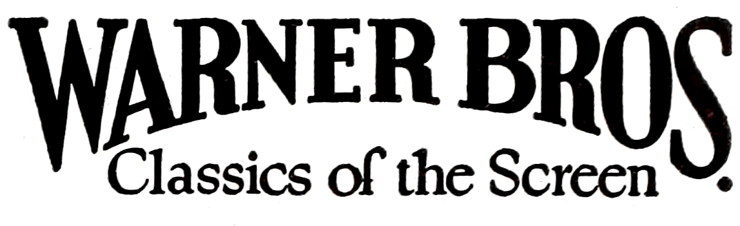
The first logo of Warner Bros. Pictures was introduced on April 4, 1923. Before the 1925 update, this logo was used as a primary logo until the same year.
Warner Brothers Productions
1925–1929
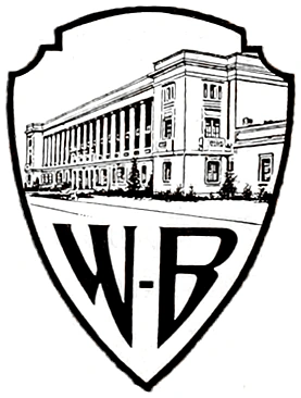
This is the very first Warner Bros. shield logo, nicknamed the "Brain Shield". The top half of the shield included a photo of the exterior of the their original studio building, with the "WB" initials occupying the bottom half, separated by a small dash. The title card with this version of the logo originally included the text "A Warner Brothers Classic of the Screen", which was later replaced with "A Warner Brothers Production" in 1926.
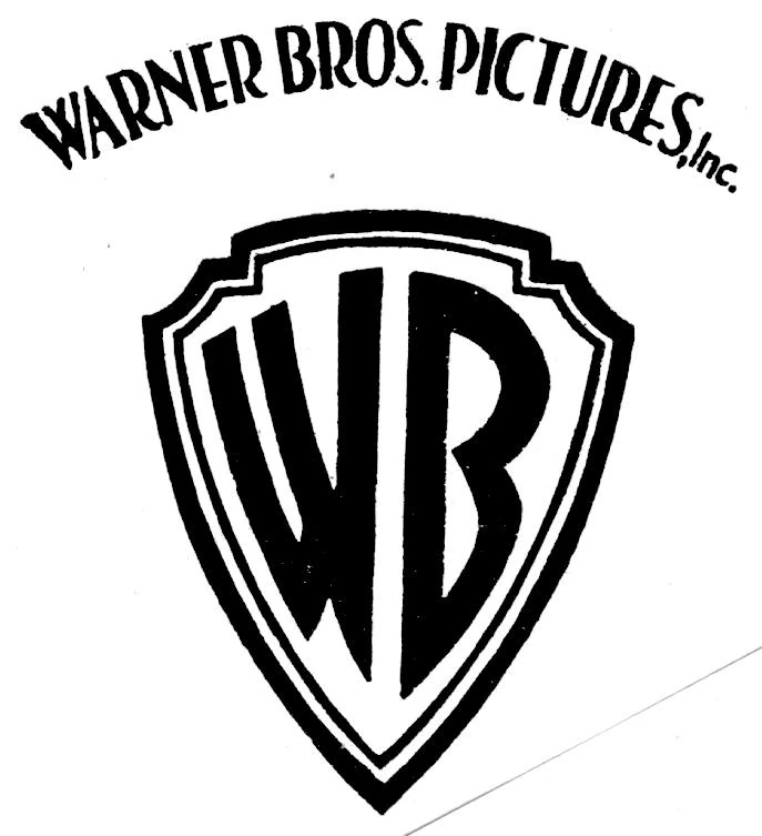
Warner Bros. Pictures Inc.
1929–1937
| SVG NEEDED |
This was the first logo design in which the "WB" letters filled the whole shield. There are two different types of the lettering "WARNER BROS. PICTURES, Inc.". This logo was also used on Looney Tunes and Merrie Melodies cartoons.
1935–1937

In 1935, this variant was used as the "Zooming W-B Shield". This logo was used on Looney Tunes and Merrie Melodies cartoons until 1937.
1937–1967
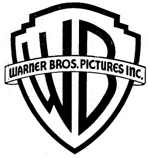
In 1937, a banner was added onto the shield reading the company's full name ("WARNER BROS. PICTURES INC.") for the first time, a design that would resonate within many of its subsequent logo designs.
Warner Bros. Pictures (first era)
1948–1967
| SVG NEEDED |
In 1948, the WB shield was introduced to resemble a shield without the banner.
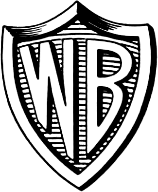
1953–1967, 1970–1972, 1985–2019

After its introduction at the end of the 1953 film Hondo, this logo was slightly modified to be used as a print logo for film trailers and other stationary media. After it was discontinued in 1972, it was later reintroduced on promotional materials in 1985 until it was discontinued again in 2019. With a total run of 52 years, this is the longest-lived logo used by the company.
Warner Bros.-Seven Arts
1967–1970

In 1967, for the first time in WB history, the text "WB" was nowhere to be found on the logo; instead, the symbol "W7", symbolizing its merger with Seven Arts, appeared.
Warner Bros., Inc./Warner Bros.
1970–1972
This logo was once superimposed over one of the backgrounds used for the 1948 logo that would later be used for the 1984 logo. This was used during the period Warner Bros. when was owned by Kinney National Company; that firm's name would sometimes appear inside the rectangular block in place of "Warner Bros." in this logo.
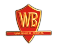
1972–1990

Famed logo designer Saul Bass, also responsible for the Geffen "G" and the United Airlines logos of the 1970s, created this logo, which was very unpopular in its time. In the commentary on the DVD of the movie Gremlins, which brought back the shield logo, director Joe Dante notes that this logo was designed to be more artsy. When the movie was made, Dante knew that it was going to have the classical feel of the classic Warner Bros. movies because of them shooting on the Warner lot and that Jerry Goldsmith was doing the music. So, they decided to bring back the shield logo and the studio loved it and they brought it back for their future movies. However, this is still used as a logo today for other Warner properties (mainly by the now-unrelated Warner Music Group), and the stylized typeface was used for WB's home video division from 1978 to 1996.
Warner Bros. Pictures (second era)
1993–present

In 1993, the banner "Warner Bros. Pictures" was re-added to the shield, resembling the 1948 and 1984 logos. It was used as the corporative logo of the company for 26 years until the rebrand in 2019, altought its on-screen variants are still used.
2019–present

After Warner Bros. Entertainment revealed a new logo on November 13, 2019, Warner Bros. Pictures also refreshed its image to match with the modern look of the new shield.
Note
Despite the name change on its logo to Warner Bros. Pictures in 1984, the company was still referred to as Warner Bros. until 2000, when its legal name in advertising materials was changed back to Warner Bros. Pictures; it is still officially referred to as Warner Bros. outside of this.
External links
Template:WarnerMedia