This page only shows primary logo variants. For other related logos and images, see:
|
| 1906–1938 | 1938–1948 | 1948–1949 | 1949–1957 | 1957–1960 |
| 1960–1968 | 1968–2008 | 1994–2008 | 2008–2019 | 2019–present |
Haloid
1906–1938
| SVG NEEDED |
1938–1948
| SVG NEEDED |
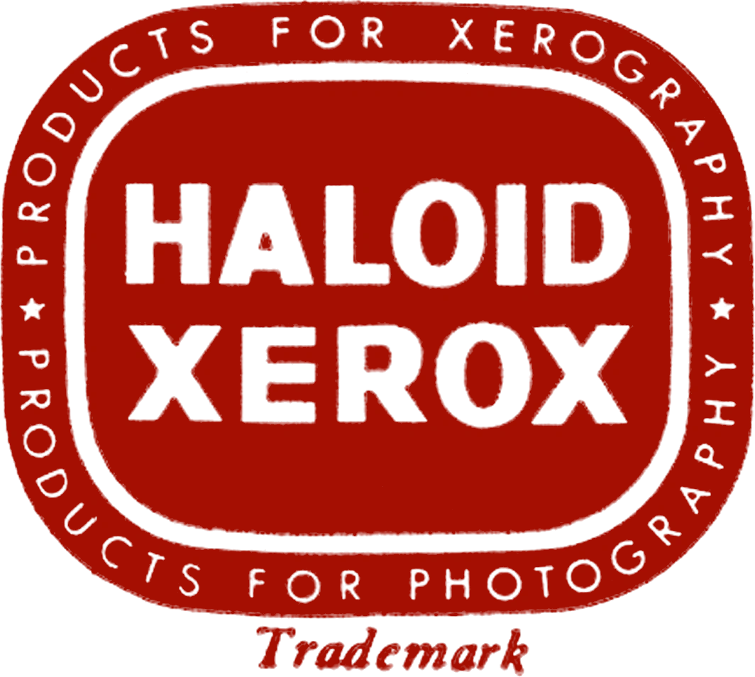
Haloid Xerox
1948–1949
| SVG NEEDED |
1949–1957
| SVG NEEDED |
1957–1960
| SVG NEEDED |
Xerox
1960–1968

| SVG NEEDED |
In 1960, the company dropped Haloid from its name and became Xerox. The wordmark was designed by Lippincott.
1968–2008

In 1968, the logo was straightened up by Tom Geismar of Chermayeff & Geismar.
1994–2008

2008–present
2008–2019

On January 7, 2008, Xerox unveiled a completely overhauled corporate identity, after 40 years of relatively minor changes. The new logo consists of the name of the company in lowercase with a red sphere which has two lines ("connectors") that cross to form an "X". The rebrand was created with Interbrand.
2019–present

The symbol was removed.