m (→1881–1895) Tag: Visual edit |
Tag: Visual edit |
||
| Line 20: | Line 20: | ||
== 1891–1895 == |
== 1891–1895 == |
||
[[File:Ymca1891.png|center|200px]] |
[[File:Ymca1891.png|center|200px]] |
||
| − | This is the first known appearance of the red triangle which is still used in the organization's logo today. The |
+ | This is the first known appearance of the red triangle which is still used in the organization's logo today, as proposed by Luther H. Gulick, MD in 1891. The equal sides of the triangle stand for “man’s essential unity, body, mind and spirit, each being a necessary and eternal part of man, he being neither one alone…”<ref>[http://www.ymca.net/sites/default/files/pdf/y-logo-history.pdf "History of the Y Logo,"] unknown author, ymca.net.</ref> |
== 1895–1896 == |
== 1895–1896 == |
||
Revision as of 08:51, 22 January 2015
Template:ImageTOC-7
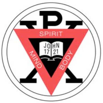
1881–1895

This was the founding organization's original logo and is today the logo of the World Alliance of YMCAs. The text in the center refers to a verse from the Christian Holy Bible's New Testament book of John, 17:21 ("That they may be one"), which was and remains the organization's motto.
1891–1895
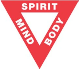
This is the first known appearance of the red triangle which is still used in the organization's logo today, as proposed by Luther H. Gulick, MD in 1891. The equal sides of the triangle stand for “man’s essential unity, body, mind and spirit, each being a necessary and eternal part of man, he being neither one alone…”[1]
1895–1896
1896–1897

1897–1967
1967–present (Worldwide)

2010–present (United States)
The YMCA in the United States revealed a new identity in July 12, 2010, now officially calling itself the Y. Siegel & Gale were behind the new identity. This logo had received negative reviews and criticism.[2]
The new logo exists in several different versions, some with and some without gradients, and several different color combinations.
References
- ↑ "History of the Y Logo," unknown author, ymca.net.
- ↑ http://06880danwoog.com/2012/01/14/the-y-has-already-moved/