This page only shows primary logo variants. For other related logos and images, see:
|
| 1881–present | 1891–1895 | 1895–1896 | 1897–1967 (primary), 1967–present (secondary) |
| 1967–present (worldwide) | 1967–2014 (United Kingdom) | 2010–present (United States) | 2014–present (United Kingdom) |
1881–present[]
This was the founding organization's original logo and is today the logo of the World Alliance of YMCAs. The text in the center refers to a verse from the Christian Holy Bible's New Testament book of John, 17:21 ("That they may be one"), which was and remains the organization's motto.
1891–1895[]
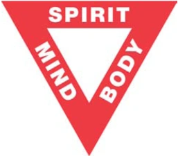
This is the first known appearance of the red triangle which is still used in the organization's logo today, as proposed by Luther H. Gulick, MD in 1891. The equal sides of the triangle stand for “man’s essential unity, body, mind and spirit, each being a necessary and eternal part of man, he being neither one alone…”
1895–1896[]
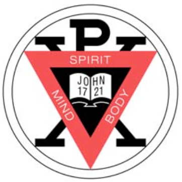
In 1895, the annual convention of the U.S. and Canadian YMCAs authorized adding the Gulick triangle to the World Alliance insignia.
1896–1897[]
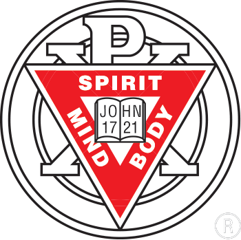
In 1896, the logo was simplified and a second ring added, representing friendship and love without end among individuals.
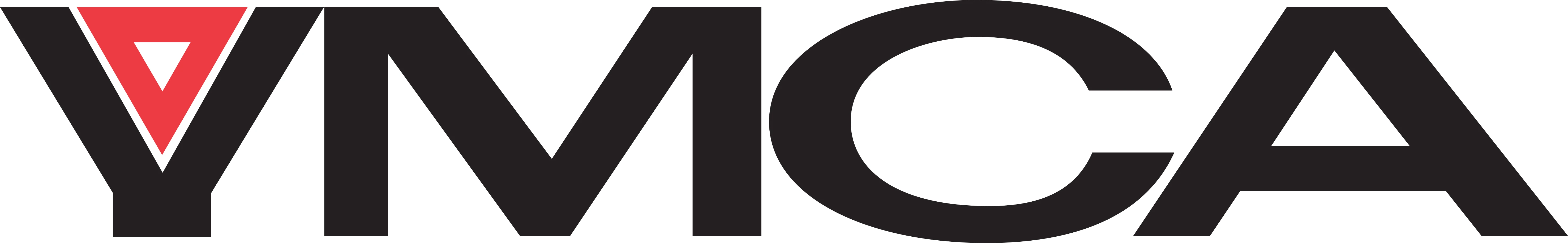
1897–1967 (primary), 1967–present (secondary)[]
This is the first simplified modern version of the logo. The text inside the red triangle was dropped, leaving just the triangle itself and the organization's initials. All religious imagery and references were also excised. Many different versions were made over the years. A similar logo remained in use by the YWCA until 1988.
1967–present (worldwide)[]

|
|
|
In 1967, the organization's National Board approved this logo design, created by a Chicago, IL designer at the behest of the Chicago YMCA's then General Executive, John Root. "We had shaped and reshaped, used and abused our symbol so much that no strong, single corporate identity came through," Root said at the time explaining the need for a new logo. It incorporates a smaller red triangle and emphasizes the group's first initial, reflecting the fact that by this time most people referred to the group and its facilities simply as "the Y."
1967–2014 (United Kingdom)[]
Also in 1967, the YMCA in the United Kingdom introduced its own logo, using elements of the logo introduced worldwide.
2010–present (United States)[]

|
|
|
The YMCA in the United States revealed a new identity on July 12, 2010, now officially calling itself the Y. After the unveiling, the logo received ample negative reviews and criticism.
The new logo exists in several different versions, some with and some without gradients, and with several different color combinations.
2014–present (United Kingdom)[]
